Support the channel and unlock everything
Many more AI messages per month, unlimited template downloads and full catalog access.
See the Pro planExplore ready-to-use dashboards, organized by business area
Many more AI messages per month, unlimited template downloads and full catalog access.
See the Pro planAsk about KPIs, get interpretations and find the right dashboard for your problem.
Open the assistantReady-made dashboards with synthetic data: view them live for free and download as a channel subscriber.
Browse templates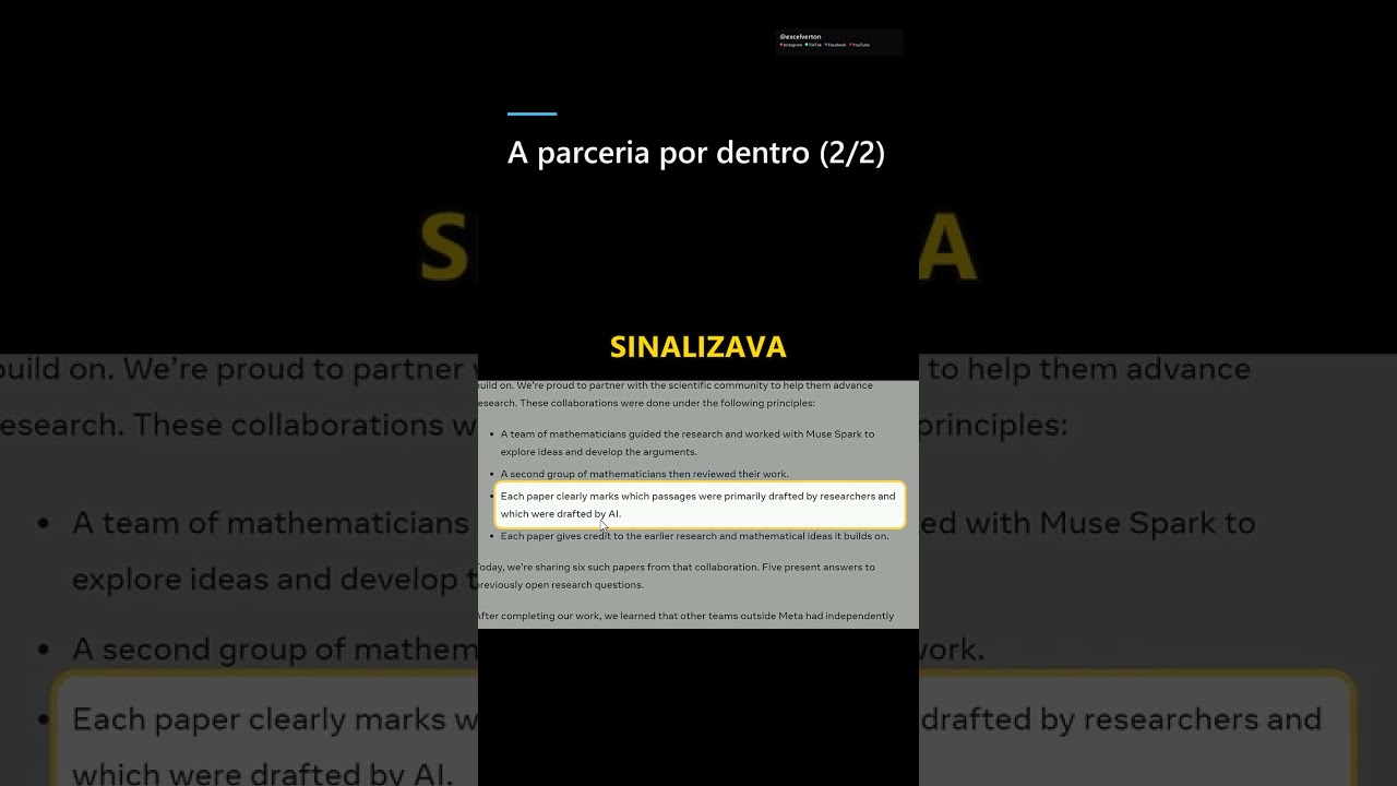

Explore 13,191 dashboards organized by area. Learn, get inspired and build.
Generic report without specific information, possibly related to a project.
The ETA report provides estimated time of arrival, useful for logistics and operations.
This report explains default sum and sorting in data visualizations.
This report uses DAX functions like Dex and GroupBy for data analysis.
This report appears to be a challenge related to using Azure and Power BI, possibly focusing on data governanc…
This report appears to be a data analytics dashboard but is not specific.
This report demonstrates how to create geospatial mappings using ArcGIS.
This report is a tutorial on conditional formatting in Power BI.
Common steps for data preparation in Power BI, including dynamic filtering and creating bases for analysis.
Analysis of Bangladesh's economy, with relevant economic data.
This report covers user-defined aggregations and their behavior after sorting by column.
This report can present data on resource allocation.
Clustering project, analyzing grouping data.
This report does not provide clear information about its content or purpose.
This report presents key performance indicators to monitor process effectiveness.
GDP data report that provides insights into the economy and financial performance.
First visualization in Power BI, showing data graphically.
This report is a version of a project, possibly focused on internal operations.
Class report that may cover learning topics.
ReallocationCategoryValuesExample is a report that may demonstrate examples of reallocating category values.
This report may be a problem resolution in a data model.
This report likely shows how to use bins and lists in Power BI for data analysis.
Power BI dashboard for varied data analysis, focused on integration and advanced visualization.
Example of a column chart created in Power BI for comparative data visualization.
Professional dashboards built by the Excelverton factory: view them live, download the full project and adapt it to your data. 100% our own content, synthetic data.
Plataforma de Dashboards e IA helps companies turn operational data into decisions, automations and insights using AI, APIs and integrated dashboards.
Watch the latest videos and keep exploring dashboard, data and AI examples.
How to identify AI's contribution in mathematical research? One group led the creation of arguments with Muse Spark, while another conducted critical…
Watch on YouTube
How to prepare a spreadsheet for AI with clear fields, consistent data, and fewer interpretation errors. Learn to organize the base, create a sample, …
Watch on YouTube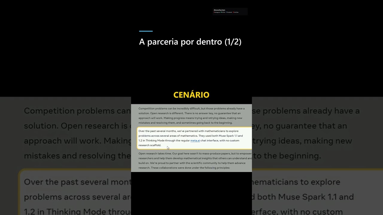
Mathematicians used AI in a common chat — and the process left verifiable traces. Access to Muse Spark in Thinking Mode happened through the meta.ai …
Watch on YouTubeWe build a custom version for your business — US$ 50 per page, delivered within 7 calendar days.