Bins ans Lists
The Bins ans Lists report analyzes data management in lists and groupings.
Create a free account
Save your favorite dashboards, get new templates by area and ask the AI assistant — for free.
About the Bins ans Lists dashboard
This is a free Power BI dashboard called Bins ans Lists, in the Operações domain. Explore KPIs, interactive visualizations and get inspired for your own data and business intelligence projects.
The Bins ans Lists report analyzes data management in lists and groupings.
Dashboard analysis
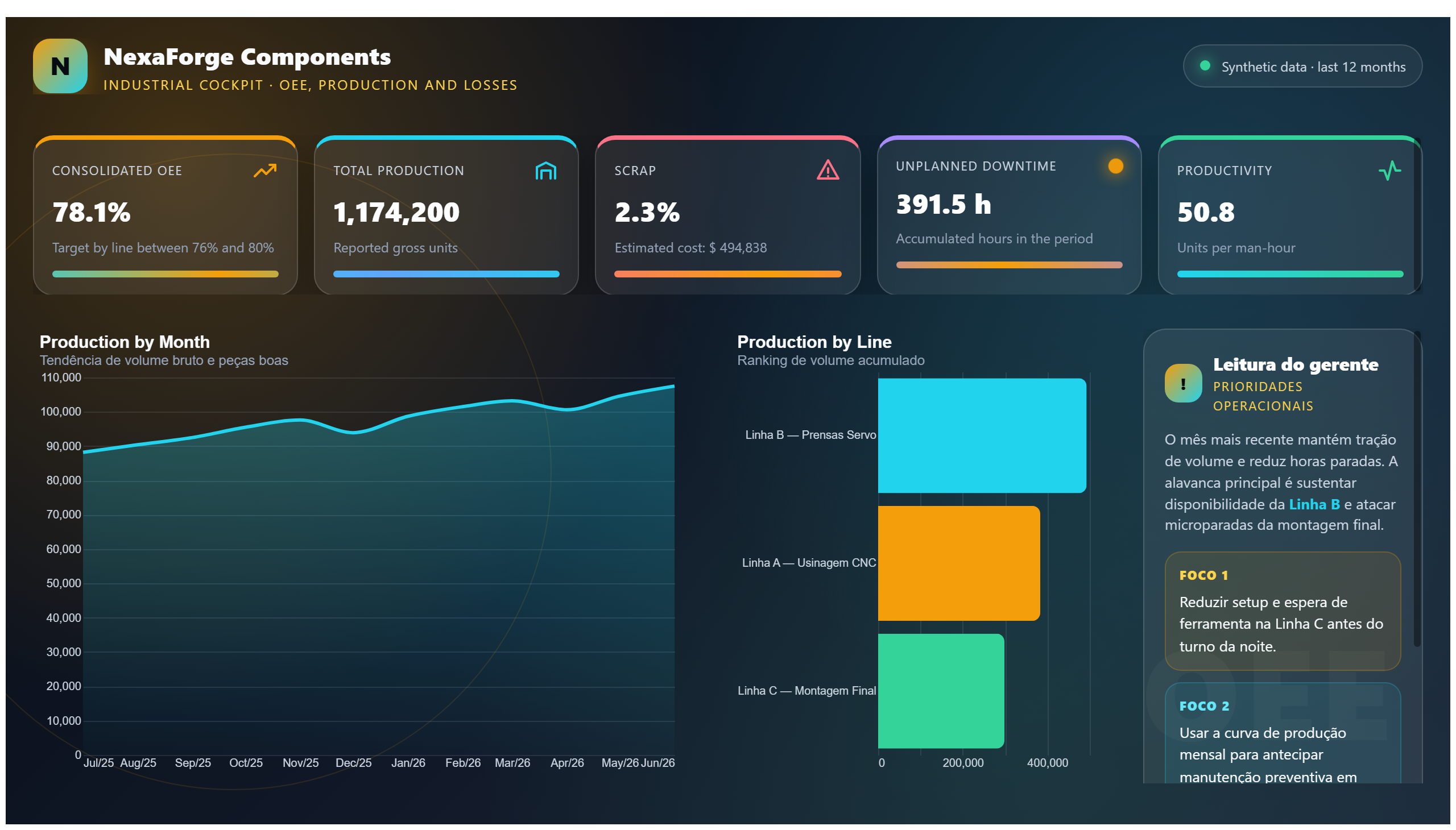
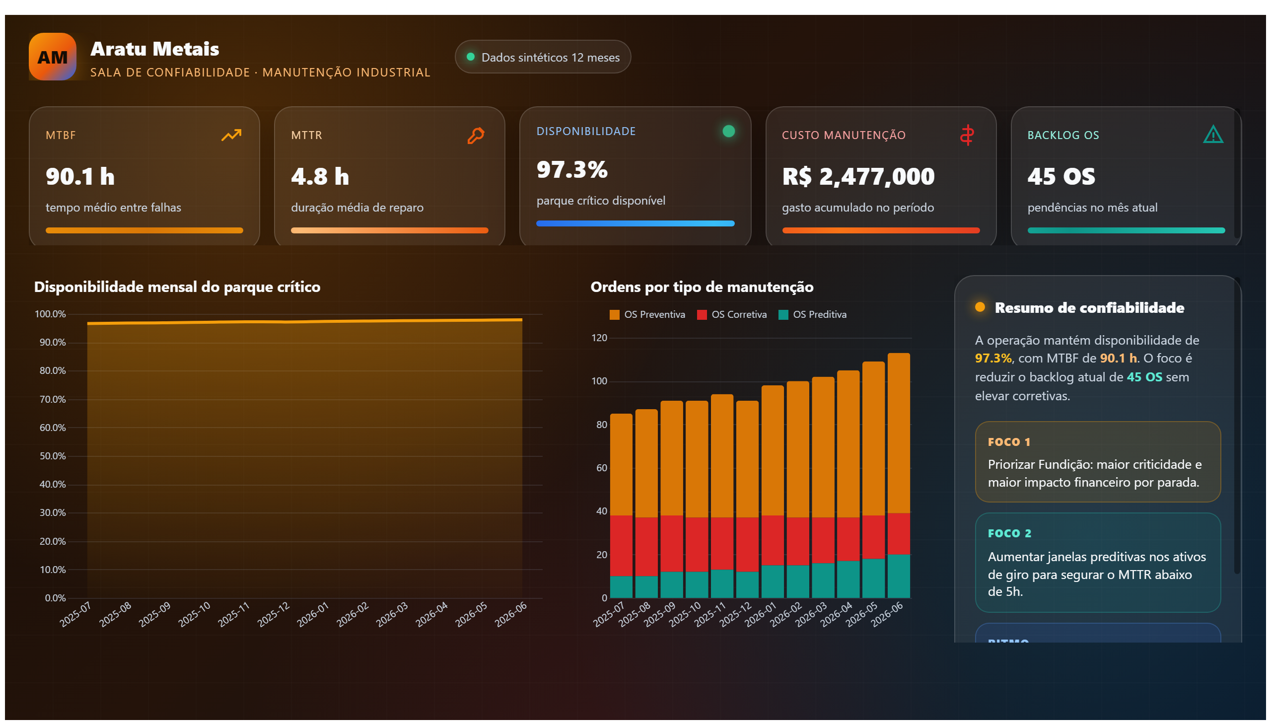
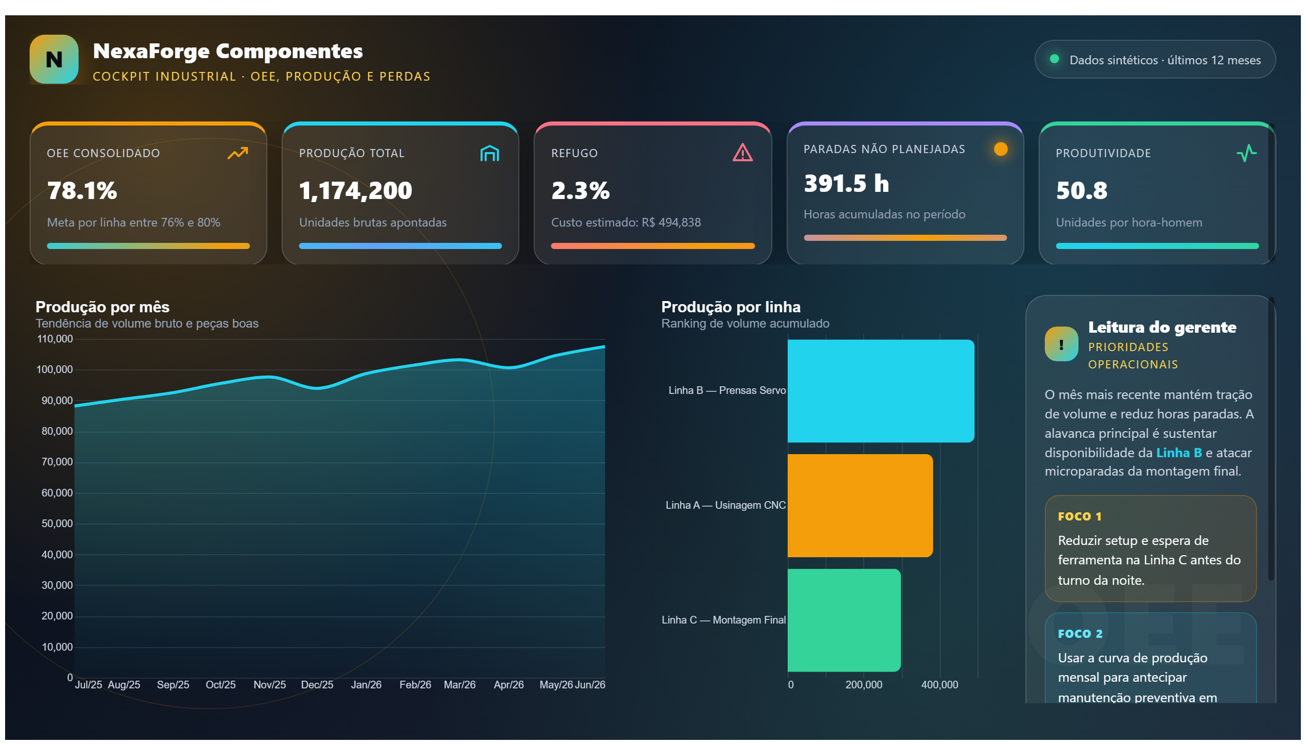
The Bins and Lists dashboard provides a comprehensive analysis of data management through the use of lists and groupings. It enables users to visualize how data is categorized and organized, facilitating a deeper understanding of operational patterns and trends. By breaking down complex datasets into manageable bins and lists, this report supports efficient data handling and decision-making processes.
This dashboard is particularly useful for operations teams seeking to monitor and optimize their workflows by examining grouped data segments. It answers critical business questions such as how data is distributed across different categories, which groups are most significant in terms of volume or performance, and how lists can be leveraged to streamline operational tasks. The insights gained here can help identify bottlenecks, improve resource allocation, and enhance overall operational efficiency.
Designed for professionals involved in operations and data analysis, the report serves as a practical tool for managers, analysts, and decision-makers who require clear and actionable views of their data structures. Its focus on grouping and listing data makes it an essential asset for those aiming to refine their reporting and operational strategies.
Frequently asked questions about this dashboard
What types of data groupings are visualized in the Bins and Lists dashboard?
The dashboard visualizes data organized into various bins and lists, allowing users to see how information is segmented and categorized within operational datasets.
Who is the primary audience for this dashboard?
The primary audience includes operations professionals, data analysts, and managers who need to understand and manage data groupings to improve operational efficiency.
How does this dashboard support decision-making in operations?
By providing clear insights into how data is grouped and distributed, the dashboard helps identify key areas for improvement, enabling better resource allocation and workflow optimization.
Want a dashboard like this with your data?
We build a custom version for your business — US$ 50 per page, delivered within 7 calendar days.
Operations Power BI templates
Complete projects built by the Excelverton factory: view them live with a free account and download the PBIP as a channel subscriber (1/month) or Pro subscriber (unlimited).
Create your free account
Save favorites, build collections and use the AI assistant — at no cost.