Telecom Customer Churn Analysis Report
This report analyzes customer churn rates in telecommunications, helping to understand customer retention.
Create a free account
Save your favorite dashboards, get new templates by area and ask the AI assistant — for free.
About the Telecom Customer Churn Analysis Report dashboard
This is a free Power BI dashboard called Telecom Customer Churn Analysis Report, in the Vendas domain. Explore KPIs, interactive visualizations and get inspired for your own data and business intelligence projects.
This report analyzes customer churn rates in telecommunications, helping to understand customer retention.
Dashboard analysis
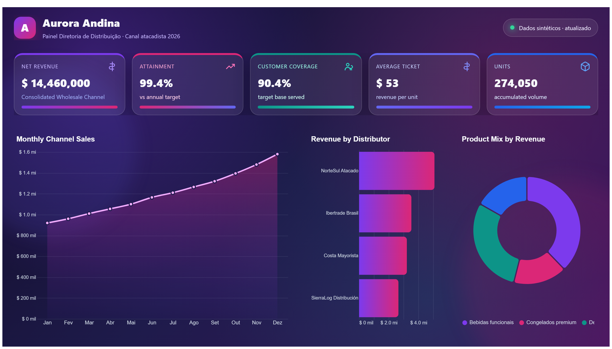
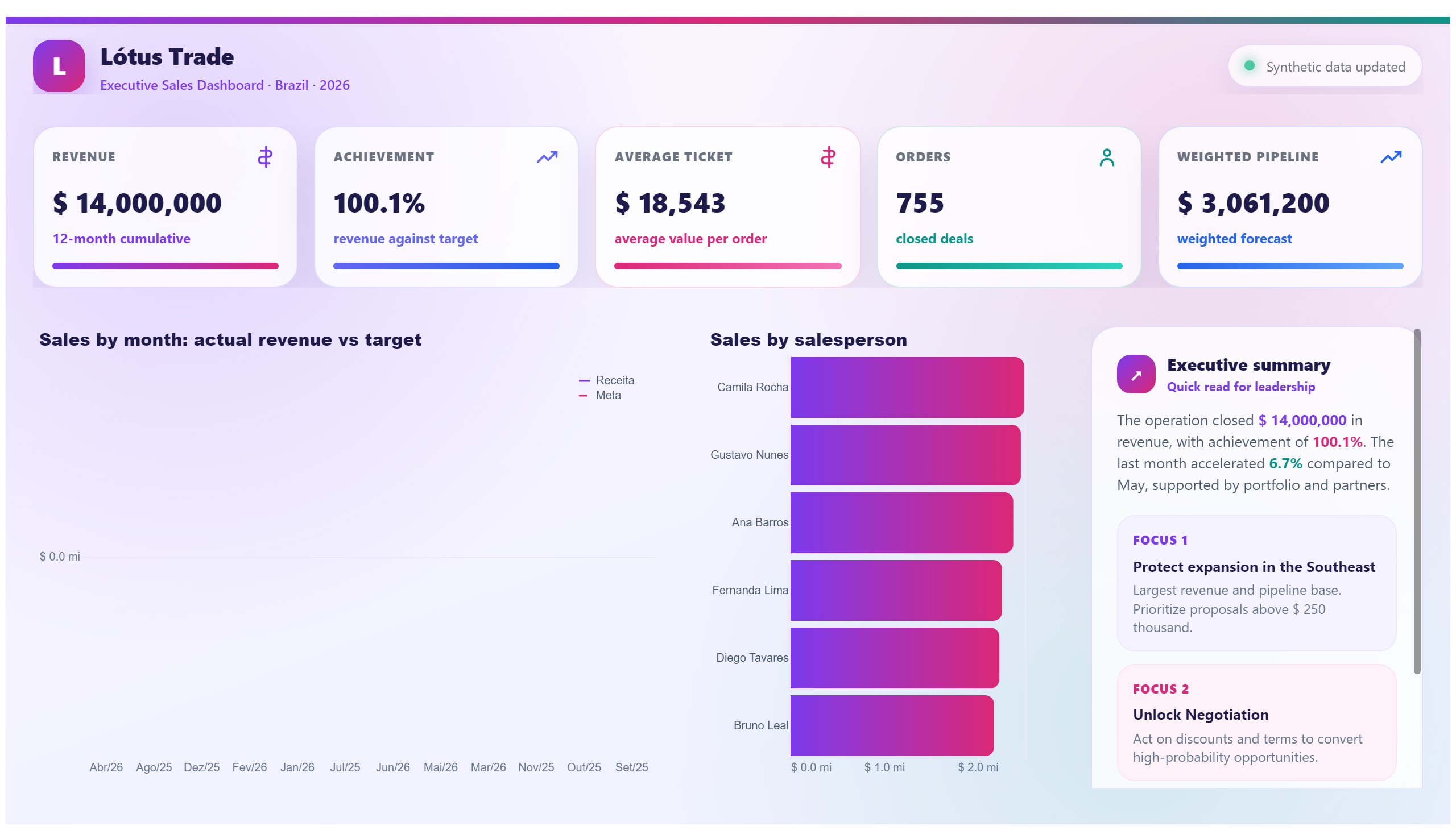
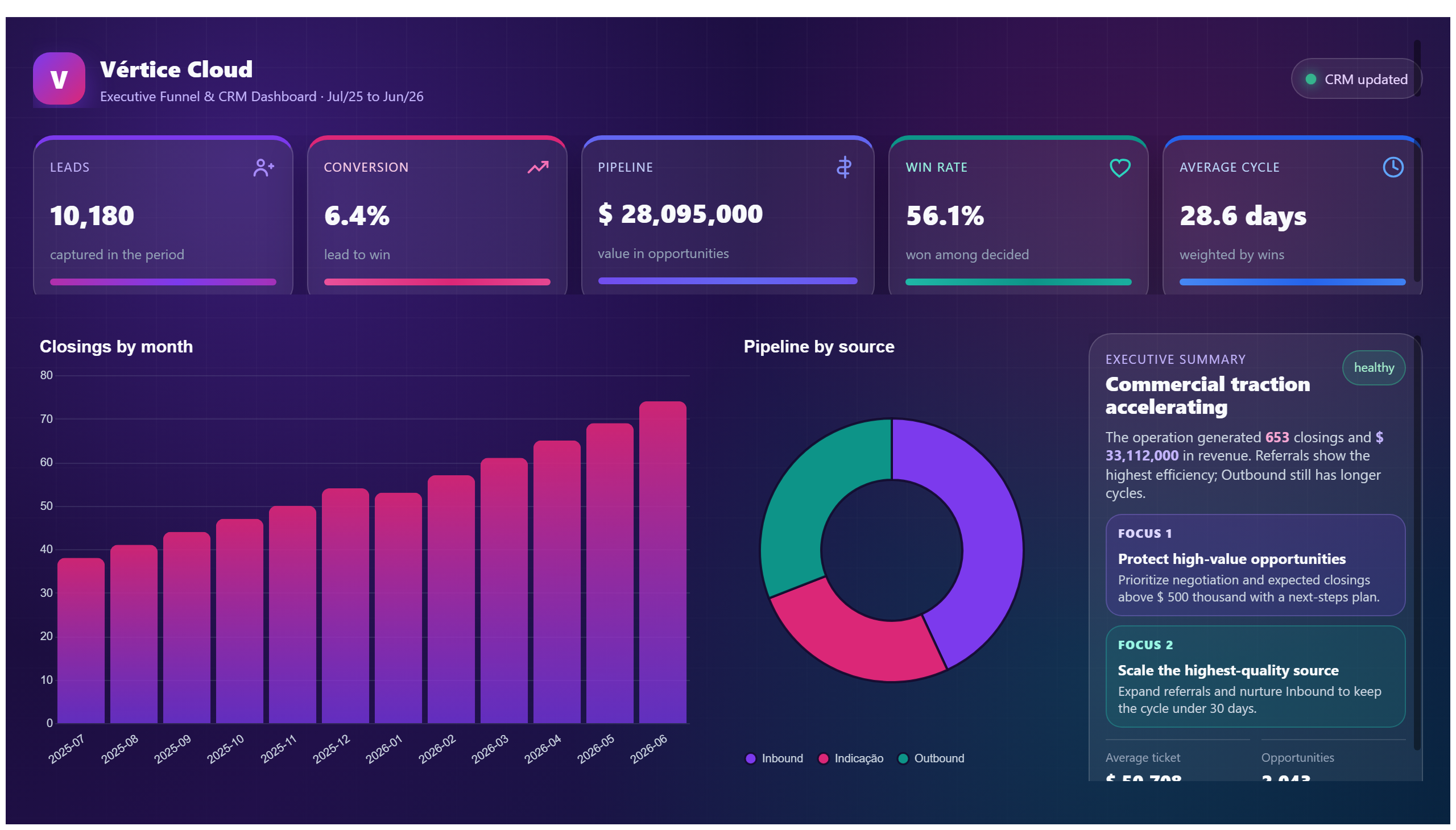
The Telecom Customer Churn Analysis Report provides a comprehensive overview of customer attrition within the telecommunications sector. This dashboard visualizes key metrics related to churn rates, enabling businesses to monitor how many customers are leaving over specific periods. By analyzing trends and patterns, companies can identify critical factors influencing customer retention and loss.
This report addresses essential business questions such as: Which customer segments exhibit the highest churn rates? What are the temporal trends in customer departures? How effective are retention strategies over time? By answering these questions, it supports decision-makers in developing targeted interventions to reduce churn and improve customer loyalty.
Ideal for sales managers, customer success teams, and business analysts, this dashboard serves as a vital tool to understand customer behavior and optimize retention efforts. It empowers stakeholders to make data-driven decisions that enhance customer satisfaction and drive revenue growth in the competitive telecom market.
Frequently asked questions about this dashboard
What specific customer segments are analyzed for churn in this report?
The dashboard breaks down churn rates by various customer segments, such as demographics, subscription plans, and usage patterns, to identify which groups are most at risk.
How can this report help improve customer retention strategies?
By highlighting trends and pinpointing factors correlated with higher churn, the report enables teams to tailor retention efforts and prioritize resources effectively.
Who is the primary audience for this dashboard?
The primary users are sales managers, customer success teams, and business analysts focused on reducing churn and enhancing customer loyalty in the telecom sector.
Want a dashboard like this with your data?
We build a custom version for your business — US$ 50 per page, delivered within 7 calendar days.
Sales Power BI templates
Complete projects built by the Excelverton factory: view them live with a free account and download the PBIP as a channel subscriber (1/month) or Pro subscriber (unlimited).
Create your free account
Save favorites, build collections and use the AI assistant — at no cost.