Exercise-Visualizing-data-by-geographical-location
Report visualizing data by geographical location, possibly for market analysis.
Create a free account
Save your favorite dashboards, get new templates by area and ask the AI assistant — for free.
About the Exercise-Visualizing-data-by-geographical-location dashboard
This is a free Power BI dashboard called Exercise-Visualizing-data-by-geographical-location, in the Operações domain. Explore KPIs, interactive visualizations and get inspired for your own data and business intelligence projects.
Report visualizing data by geographical location, possibly for market analysis.
Dashboard analysis
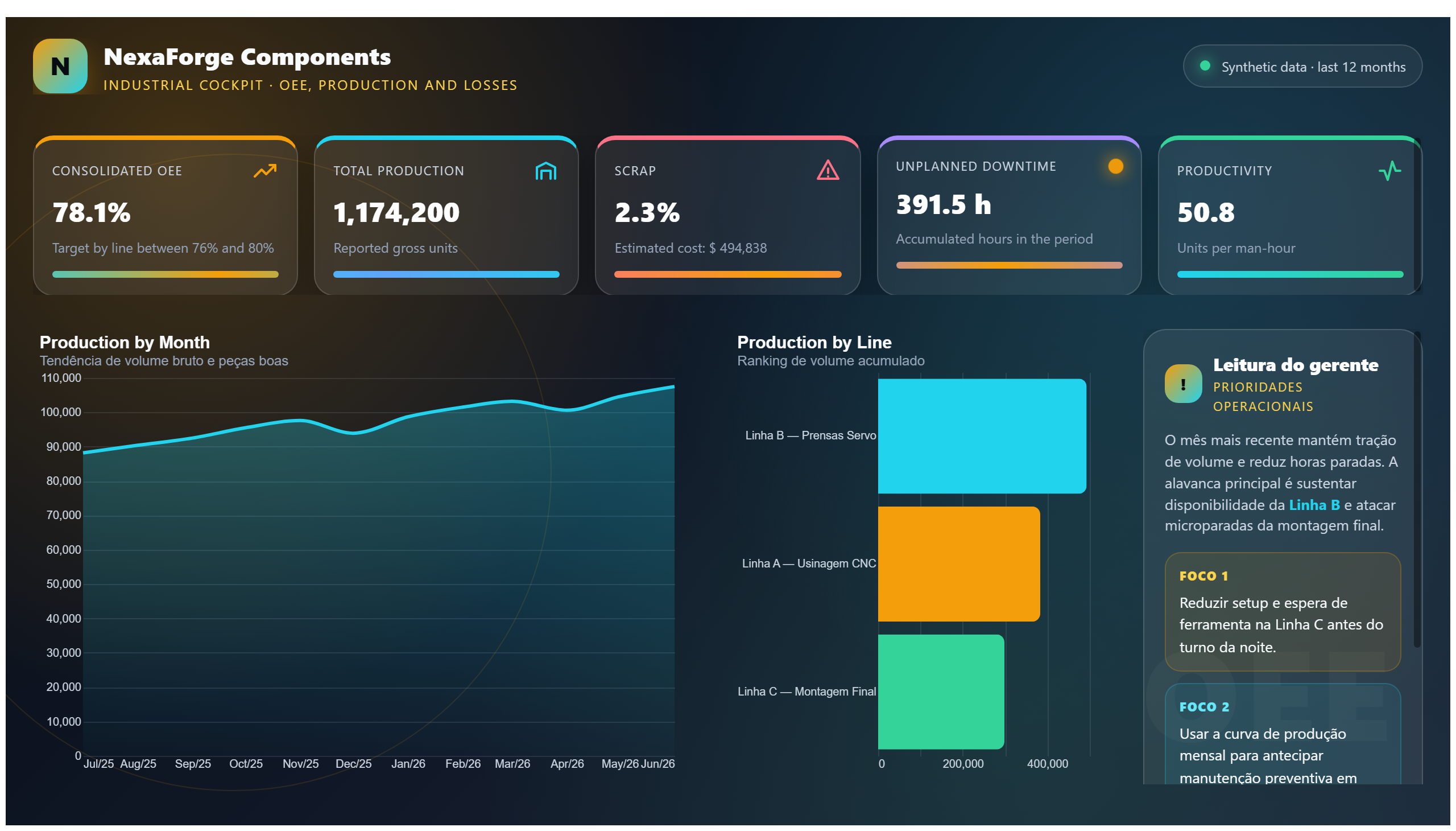
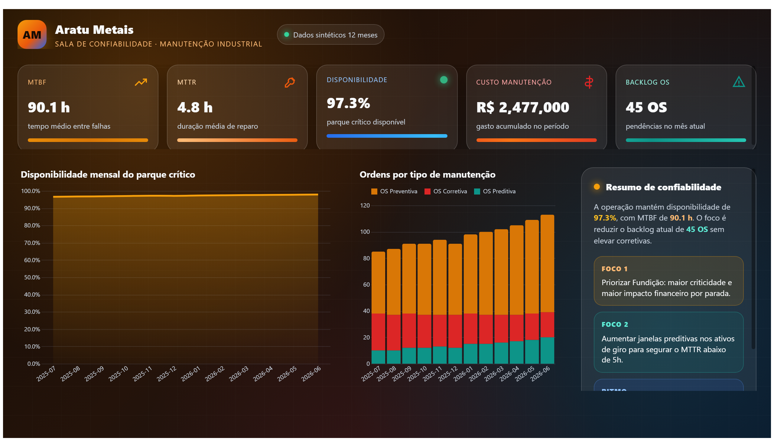
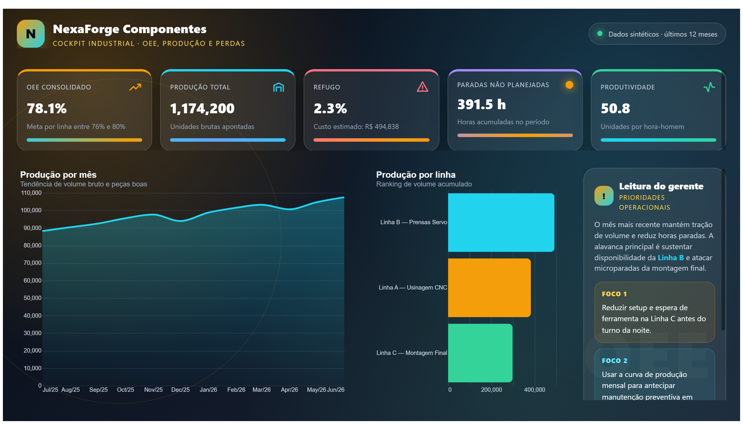
This dashboard titled Exercise-Visualizing-data-by-geographical-location offers a clear visualization of data segmented by geographical regions. It is designed to help users understand spatial patterns and trends, which can be crucial for market analysis and operational decision-making. By mapping data points to specific locations, the report enables stakeholders to identify regional performance variations, customer distribution, or resource allocation needs.
The dashboard answers key business questions such as: Which regions show the highest or lowest activity? Are there geographic clusters that indicate market opportunities or risks? How does performance vary across different locations? These insights are valuable for operations teams aiming to optimize logistics, sales strategies, or resource deployment based on geographic insights.
Primarily targeted at operations professionals and analysts, this report supports data-driven decisions by providing a geographic lens on business data. It facilitates a better understanding of how location impacts performance and helps prioritize actions in specific areas to improve overall business outcomes.
Frequently asked questions about this dashboard
What type of data can be visualized by geographical location in this dashboard?
The dashboard visualizes various operational data points mapped to specific geographic locations, enabling analysis of regional trends and patterns.
Who is the primary audience for this dashboard?
Operations professionals and analysts who need to understand and act on geographic variations in business data are the main users of this dashboard.
What business questions does this dashboard help answer?
It helps identify which regions have higher or lower activity, detect geographic clusters of opportunity or risk, and understand performance differences across locations.
Want a dashboard like this with your data?
We build a custom version for your business — US$ 50 per page, delivered within 7 calendar days.
Operations Power BI templates
Complete projects built by the Excelverton factory: view them live with a free account and download the PBIP as a channel subscriber (1/month) or Pro subscriber (unlimited).
Create your free account
Save favorites, build collections and use the AI assistant — at no cost.