HeartAttack Visualisation
Visualization of data related to heart attacks, including risk factors.
Create a free account
Save your favorite dashboards, get new templates by area and ask the AI assistant — for free.
About the HeartAttack Visualisation dashboard
This is a free Power BI dashboard called HeartAttack Visualisation, in the Saúde domain. Explore KPIs, interactive visualizations and get inspired for your own data and business intelligence projects.
Visualization of data related to heart attacks, including risk factors.
Dashboard analysis
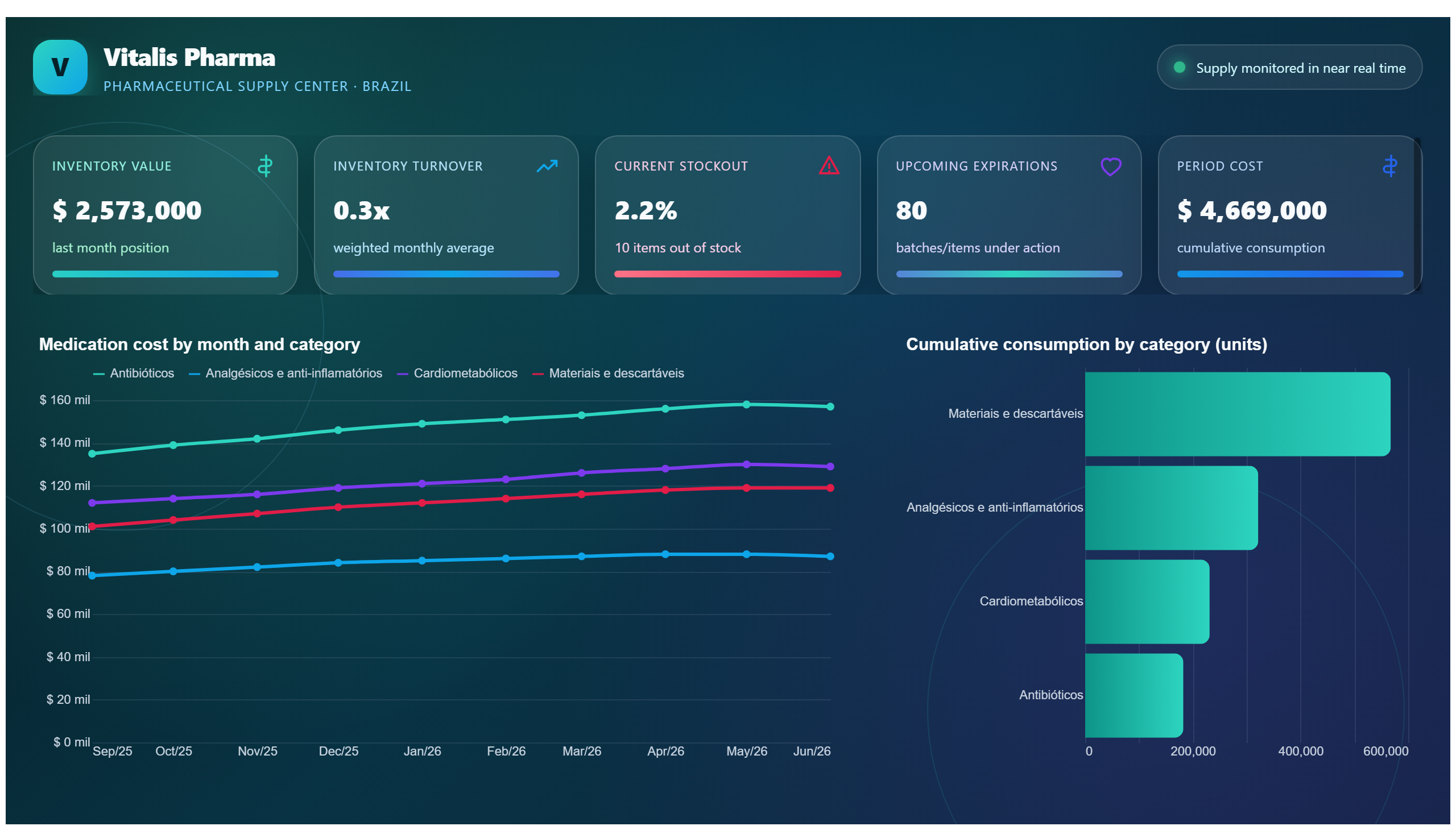
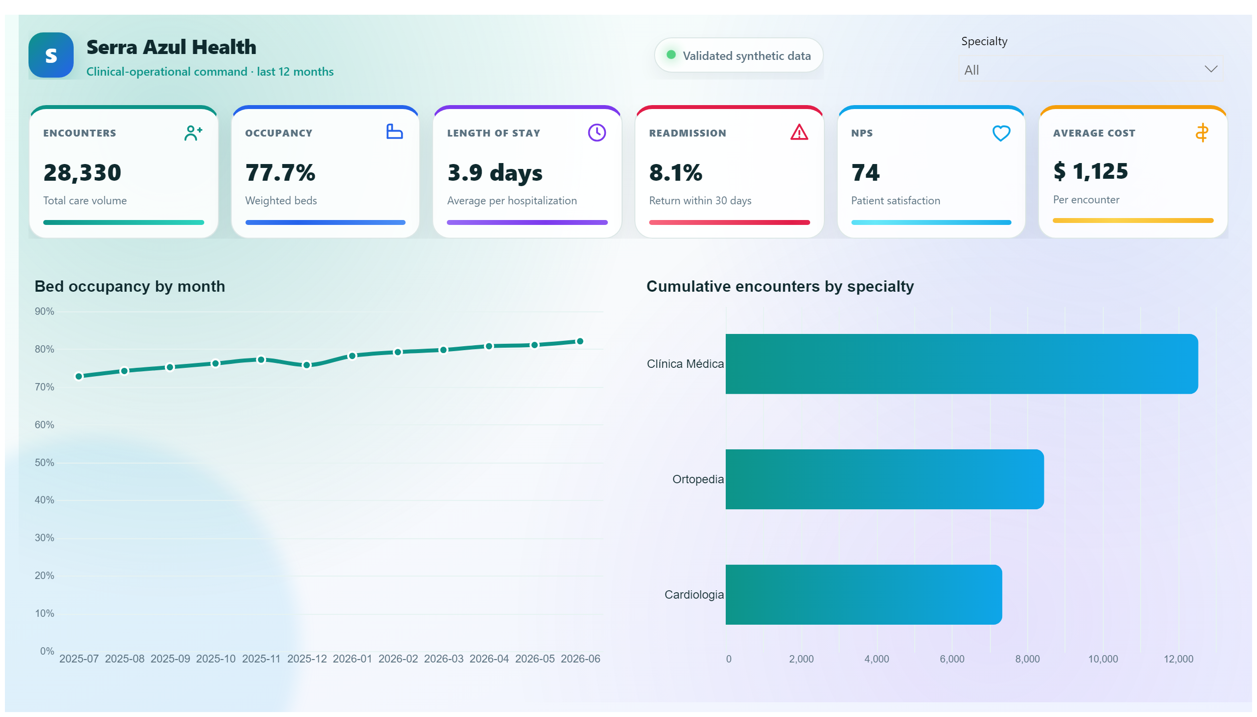
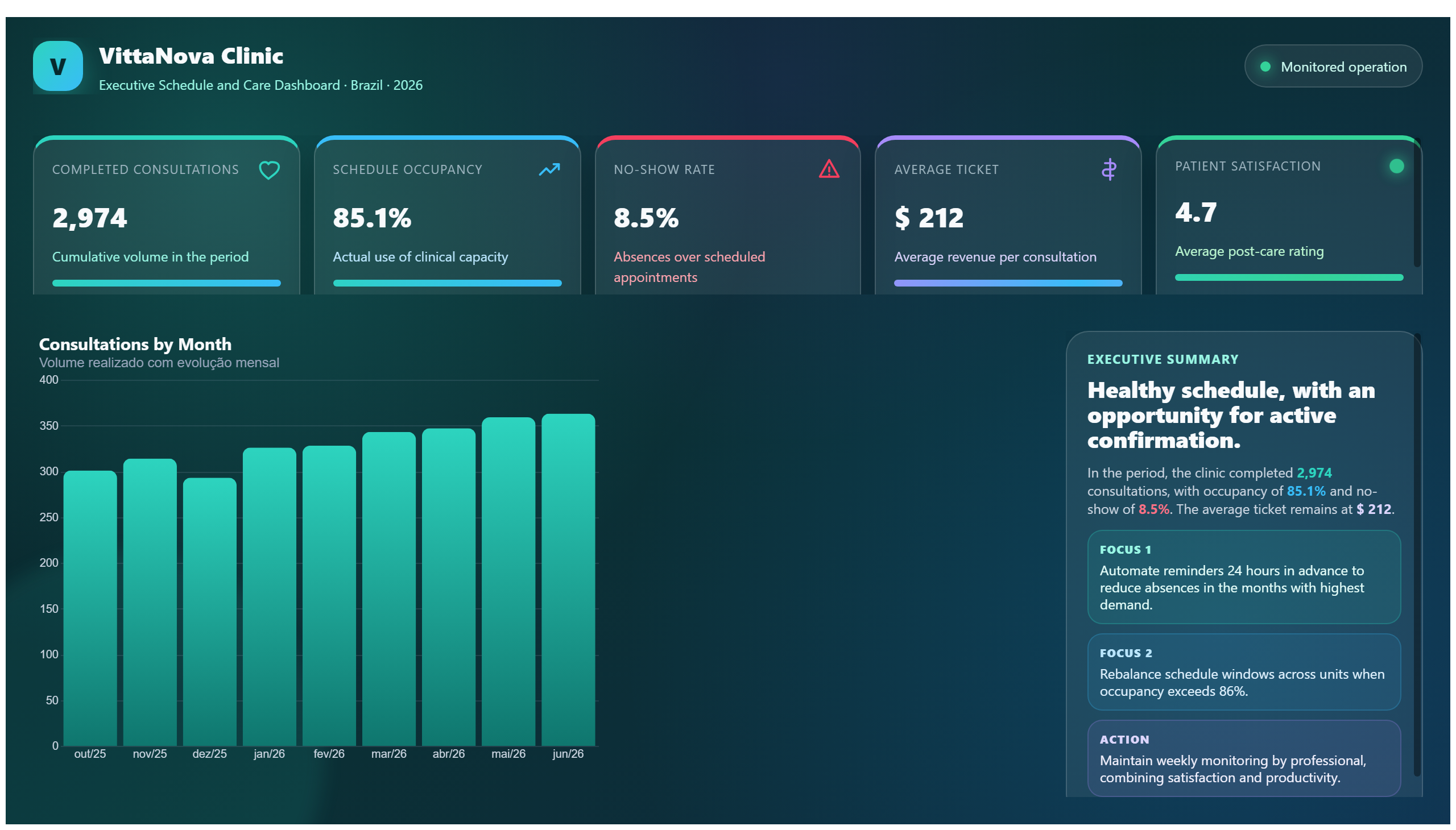
The HeartAttack Visualisation dashboard provides a comprehensive view of data related to heart attacks, focusing on various risk factors that contribute to cardiac events. By presenting this information visually, the dashboard enables healthcare professionals and analysts to identify patterns and correlations among different variables, such as age, lifestyle habits, and medical history.
This dashboard answers critical business questions like: Which risk factors have the strongest association with heart attacks? How do these factors vary across different patient demographics? What trends can be observed over time or across regions? By addressing these questions, it supports decision-making in clinical settings, public health planning, and patient education.
Designed primarily for healthcare providers, researchers, and public health officials, the dashboard facilitates data-driven strategies to prevent heart attacks and improve patient outcomes. Its clear visualizations make complex data accessible, helping stakeholders to prioritize interventions and allocate resources effectively within the health domain.
Frequently asked questions about this dashboard
What specific risk factors are visualized in this dashboard?
The dashboard includes various heart attack risk factors such as age, smoking status, cholesterol levels, blood pressure, and family history.
Who is the primary audience for this dashboard?
The dashboard is intended for healthcare professionals, researchers, and public health officials involved in cardiac care and prevention.
How can this dashboard support decision-making in healthcare?
By highlighting key risk factors and their relationships, the dashboard helps stakeholders identify high-risk groups and tailor prevention strategies accordingly.
Want a dashboard like this with your data?
We build a custom version for your business — US$ 50 per page, delivered within 7 calendar days.
Healthcare Power BI templates
Complete projects built by the Excelverton factory: view them live with a free account and download the PBIP as a channel subscriber (1/month) or Pro subscriber (unlimited).
Create your free account
Save favorites, build collections and use the AI assistant — at no cost.