COVID-19 US
This report shows data about the COVID-19 pandemic in the United States.
Create a free account
Save your favorite dashboards, get new templates by area and ask the AI assistant — for free.
About the COVID-19 US dashboard
This is a free Power BI dashboard called COVID-19 US, in the Saúde domain. Explore KPIs, interactive visualizations and get inspired for your own data and business intelligence projects.
This report shows data about the COVID-19 pandemic in the United States.
Dashboard analysis
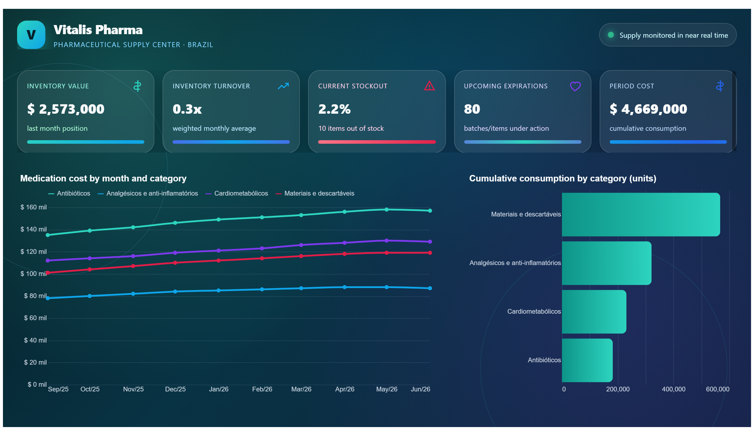
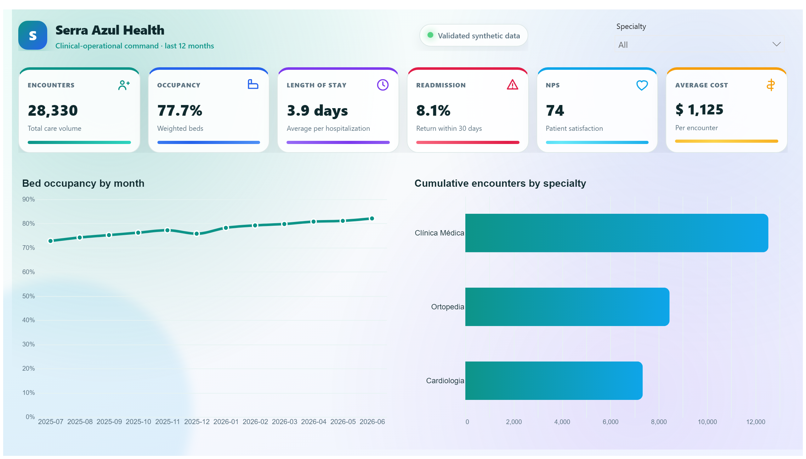
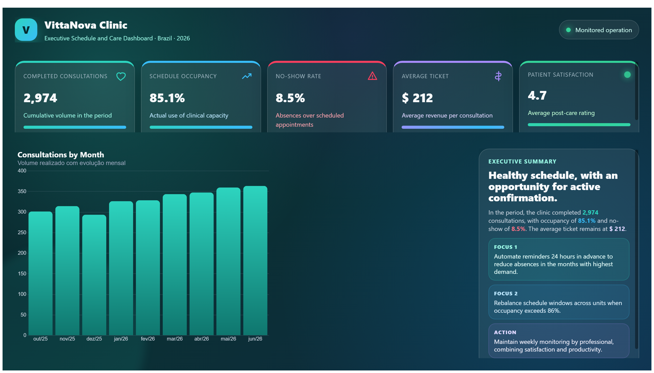
This dashboard provides a comprehensive overview of the COVID-19 pandemic situation in the United States. It presents key data points such as infection rates, hospitalization numbers, and mortality statistics, allowing users to track the progression and impact of the virus over time. The visualizations help identify trends and regional differences, offering valuable insights into how the pandemic has evolved across different states.
Business users, healthcare professionals, and policymakers can leverage this report to answer critical questions such as: Which areas are experiencing surges in cases? How are hospitalization rates changing? What is the current mortality rate compared to earlier phases of the pandemic? This information supports informed decision-making regarding resource allocation, public health strategies, and communication efforts to mitigate the virus's spread.
Overall, the dashboard serves as a vital tool for stakeholders involved in managing the health crisis, enabling them to monitor real-time data and respond effectively to emerging challenges.
Frequently asked questions about this dashboard
What specific COVID-19 metrics are displayed in this dashboard?
The dashboard shows infection rates, hospitalization numbers, and mortality statistics related to COVID-19 in the United States.
Can this dashboard help identify regional differences in the pandemic's impact?
Yes, it highlights trends and variations across different states, allowing users to compare the pandemic's effects regionally.
Who is the primary audience for this COVID-19 US dashboard?
The dashboard is designed for healthcare professionals, policymakers, and business users who need to monitor and respond to the pandemic.
Want a dashboard like this with your data?
We build a custom version for your business — US$ 50 per page, delivered within 7 calendar days.
Healthcare Power BI templates
Complete projects built by the Excelverton factory: view them live with a free account and download the PBIP as a channel subscriber (1/month) or Pro subscriber (unlimited).
Create your free account
Save favorites, build collections and use the AI assistant — at no cost.