Covid-19 project
This report is a project about Covid-19, possibly addressing different aspects of the pandemic.
Create a free account
Save your favorite dashboards, get new templates by area and ask the AI assistant — for free.
About the Covid-19 project dashboard
This is a free Power BI dashboard called Covid-19 project, in the Saúde domain. Explore KPIs, interactive visualizations and get inspired for your own data and business intelligence projects.
This report is a project about Covid-19, possibly addressing different aspects of the pandemic.
Dashboard analysis
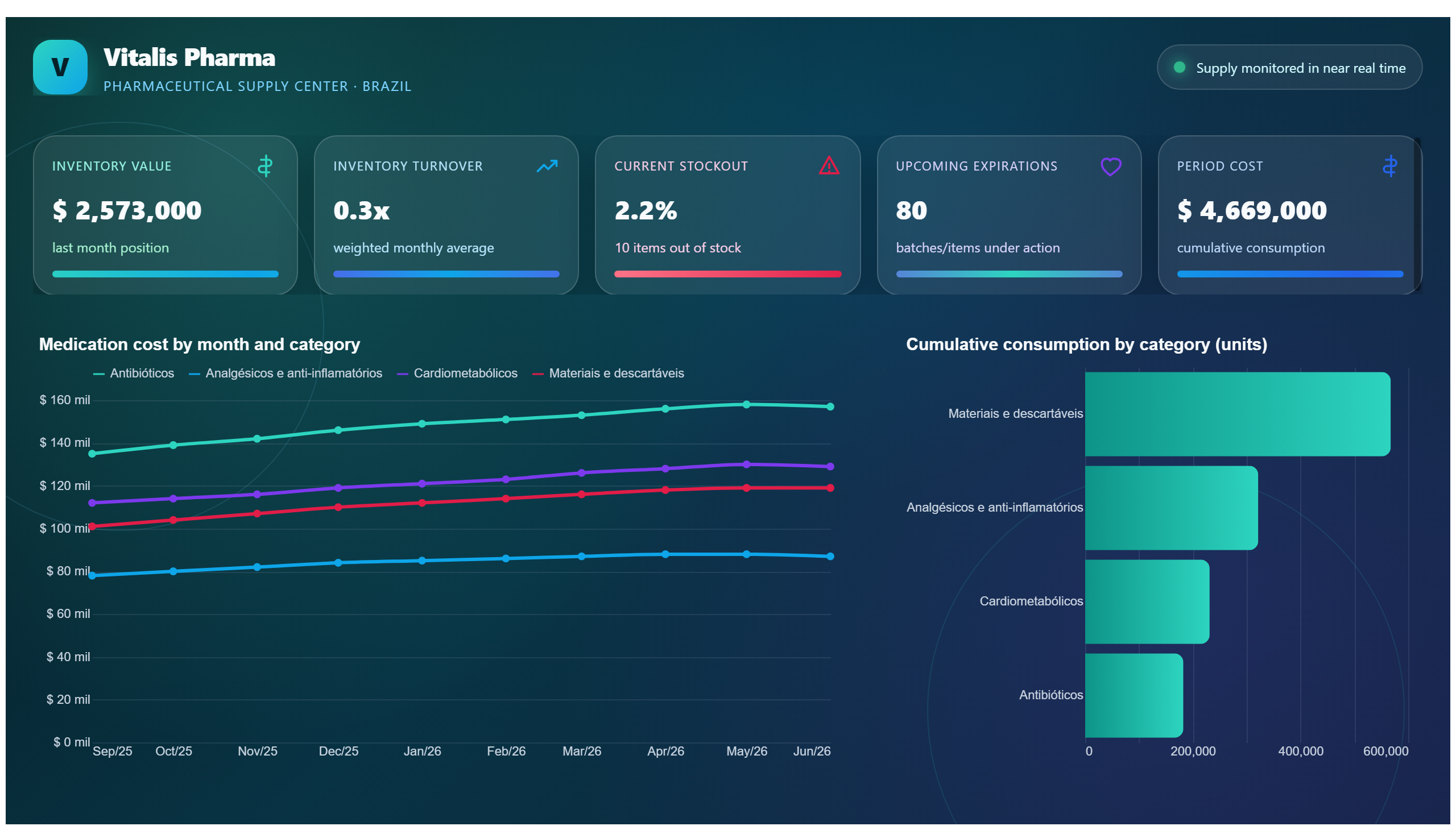
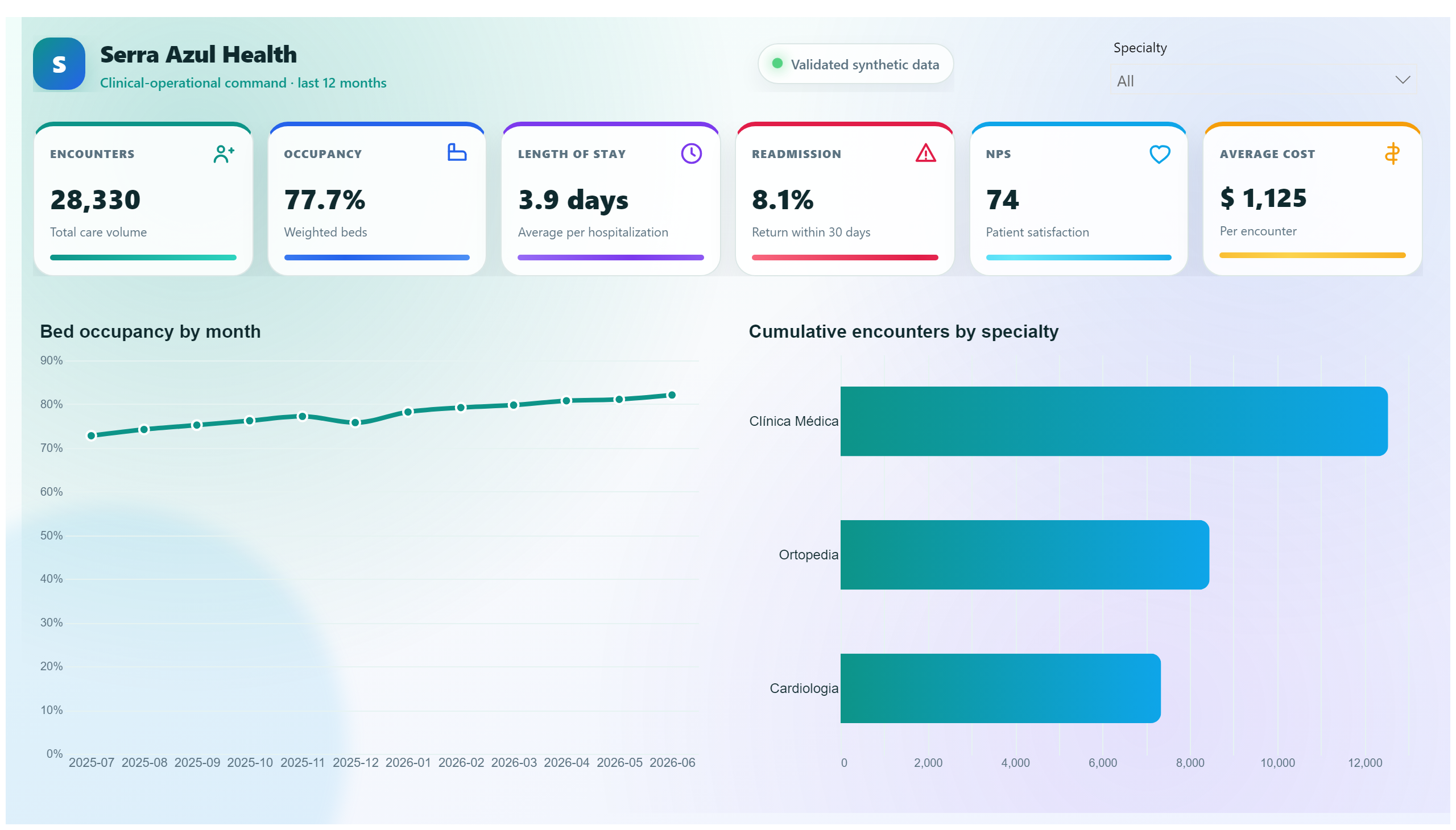
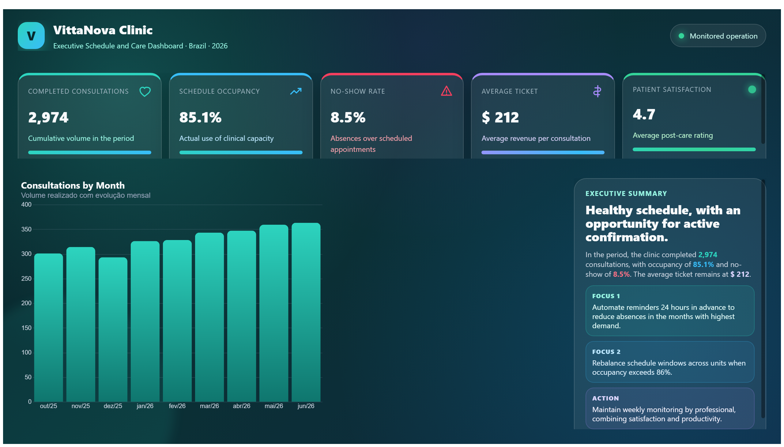
Covid-19 Project Dashboard offers a comprehensive overview of various aspects related to the Covid-19 pandemic. This report consolidates critical data to help users understand the progression, impact, and key metrics of the pandemic over time. By visualizing trends and patterns, it supports informed decision-making for health professionals, policymakers, and researchers.
The dashboard addresses essential business questions such as: How has the infection rate evolved? What are the current hospitalization and recovery rates? Which regions or demographics are most affected? It enables users to monitor the effectiveness of interventions and allocate resources efficiently.
Designed primarily for the healthcare domain, this project serves public health officials, epidemiologists, and project managers involved in pandemic response and planning. Its clear and focused presentation makes it a valuable tool for anyone seeking to analyze Covid-19 data in a structured and actionable manner.
Frequently asked questions about this dashboard
What specific Covid-19 metrics does this dashboard track?
The dashboard tracks key metrics such as infection rates, hospitalization numbers, recovery rates, and possibly geographical distribution of cases.
Who is the intended audience for this Covid-19 project dashboard?
It is intended for healthcare professionals, public health officials, researchers, and project managers involved in monitoring and managing the pandemic.
How can this dashboard assist in pandemic response planning?
By providing clear visualizations of Covid-19 trends and impact, the dashboard helps users evaluate intervention effectiveness and make data-driven decisions for resource allocation.
Want a dashboard like this with your data?
We build a custom version for your business — US$ 50 per page, delivered within 7 calendar days.
Healthcare Power BI templates
Complete projects built by the Excelverton factory: view them live with a free account and download the PBIP as a channel subscriber (1/month) or Pro subscriber (unlimited).
Create your free account
Save favorites, build collections and use the AI assistant — at no cost.