08-25 - Animated Chart
Report presenting an animated chart, possibly for dynamic data visualization.
Create a free account
Save your favorite dashboards, get new templates by area and ask the AI assistant — for free.
About the 08-25 - Animated Chart dashboard
This is a free Power BI dashboard called 08-25 - Animated Chart, in the Operações domain. Explore KPIs, interactive visualizations and get inspired for your own data and business intelligence projects.
Report presenting an animated chart, possibly for dynamic data visualization.
Dashboard analysis
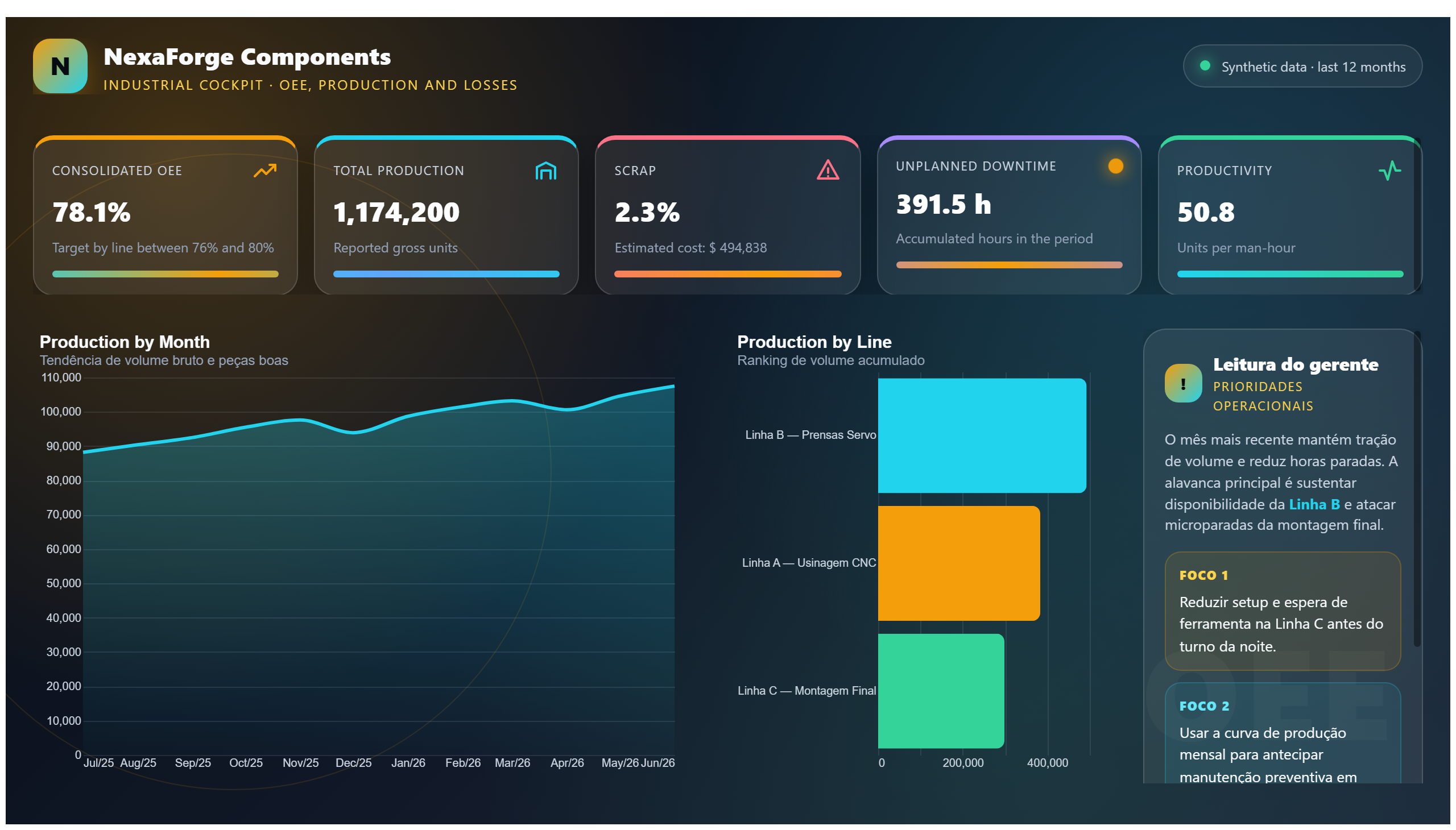
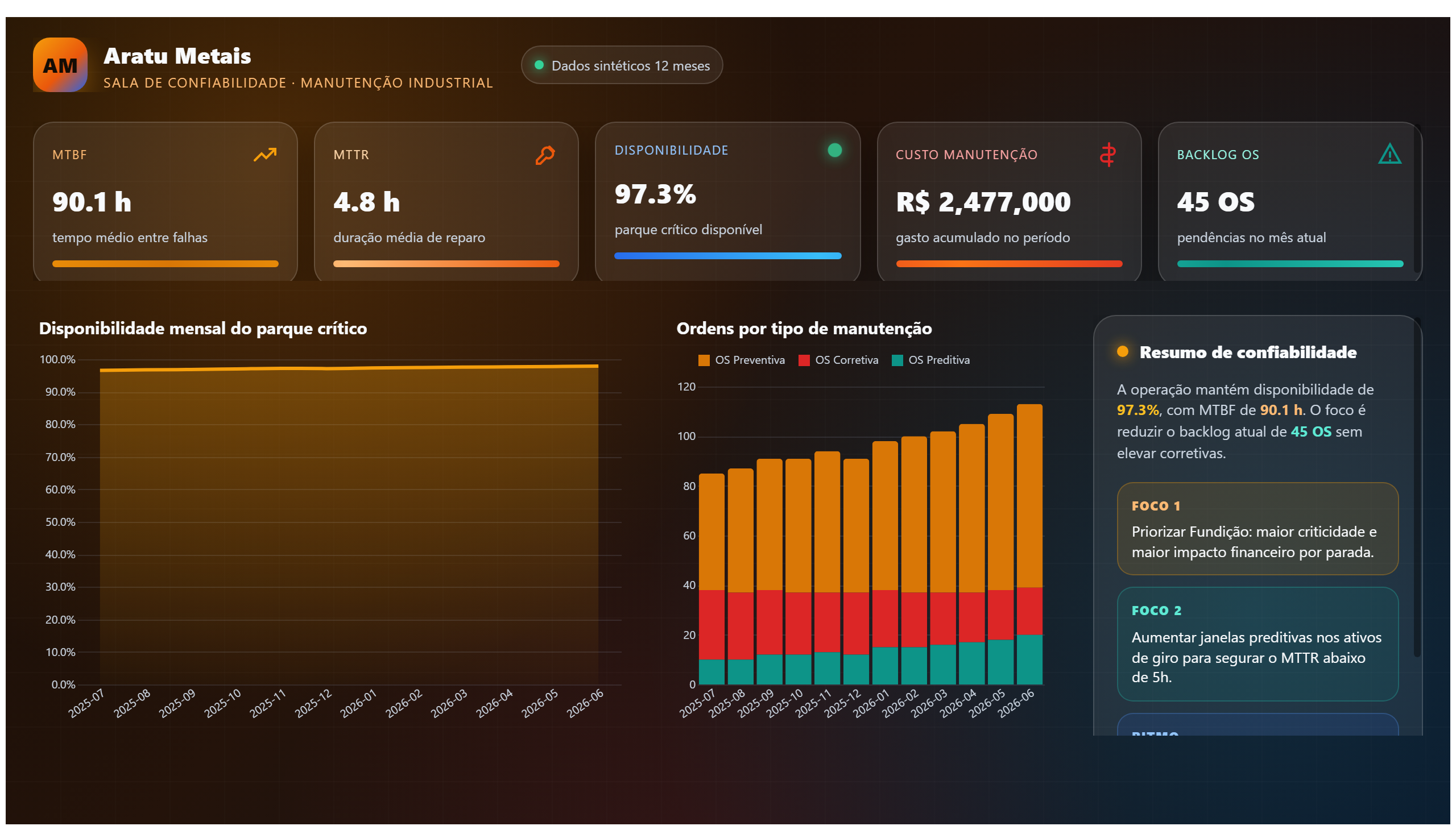
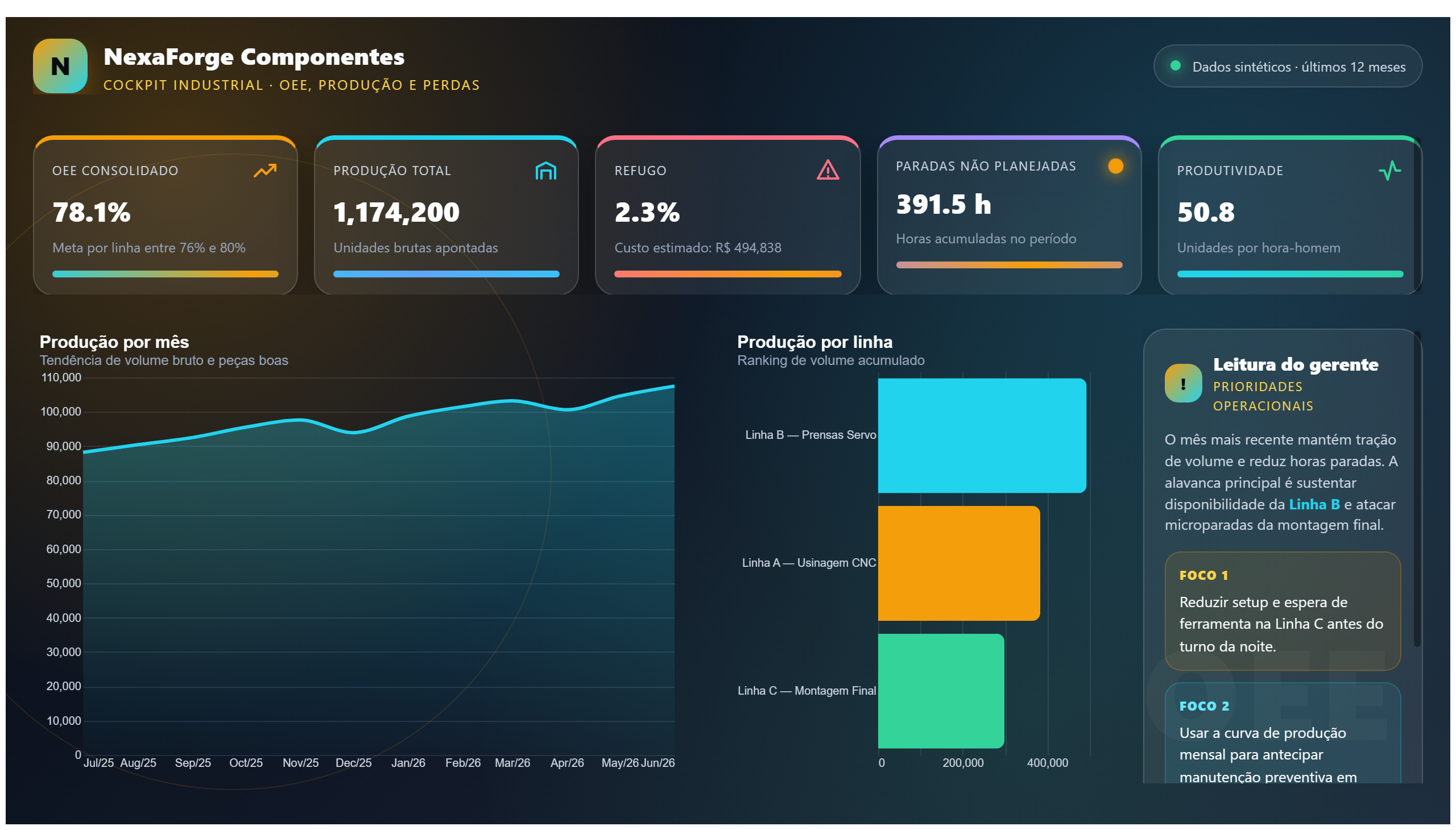
The "08-25 - Animated Chart" dashboard offers a dynamic visualization tool designed to present data trends over time through animation. This approach allows users to observe changes and patterns in the dataset in a more engaging and intuitive manner compared to static charts. By animating the data points, the dashboard highlights temporal shifts and fluctuations that might otherwise be overlooked.
Primarily suited for operations teams, this dashboard helps answer critical business questions such as: How do key operational metrics evolve over a specific period? Are there identifiable trends or anomalies in the data that require attention? The animated format supports decision-makers in quickly grasping the flow and progression of operational data, enabling timely interventions and strategy adjustments.
Overall, this dashboard serves professionals who need to monitor dynamic datasets and communicate insights effectively, making it a valuable asset for operational analysis and reporting.
Frequently asked questions about this dashboard
What type of data is best suited for this animated chart?
Data that changes over time and benefits from visualizing trends or movements, such as operational metrics or time-series data, is best suited for this animated chart.
Can the animation speed or duration be customized in the dashboard?
The description does not specify customization options for animation speed or duration, so it is unclear if these features are available.
Who is the primary audience for this dashboard?
The primary audience is operations teams who need to analyze and monitor dynamic data through engaging visualizations.
Want a dashboard like this with your data?
We build a custom version for your business — US$ 50 per page, delivered within 7 calendar days.
Operations Power BI templates
Complete projects built by the Excelverton factory: view them live with a free account and download the PBIP as a channel subscriber (1/month) or Pro subscriber (unlimited).
Create your free account
Save favorites, build collections and use the AI assistant — at no cost.