Gallery Deneb Grafico De barras
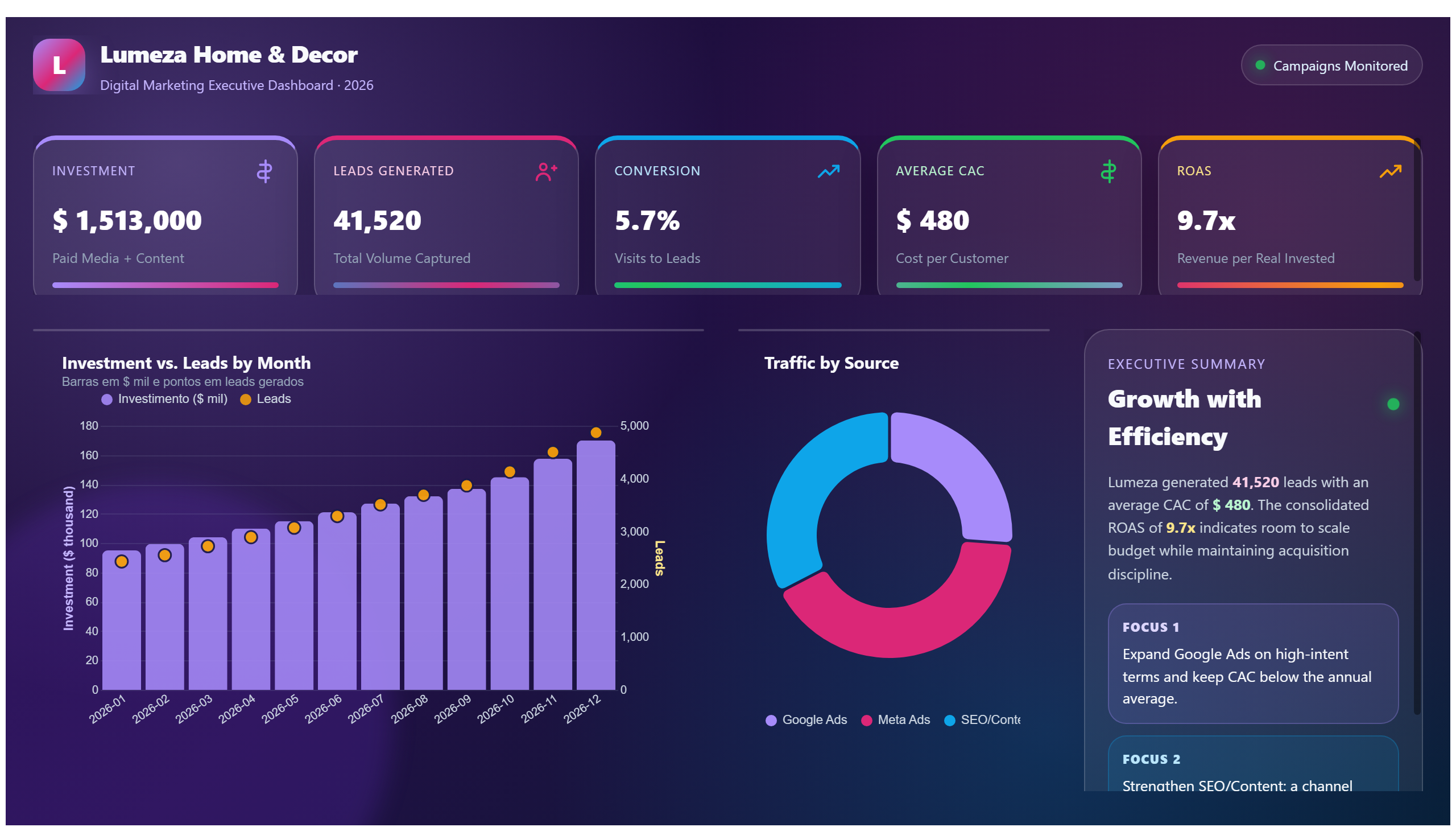
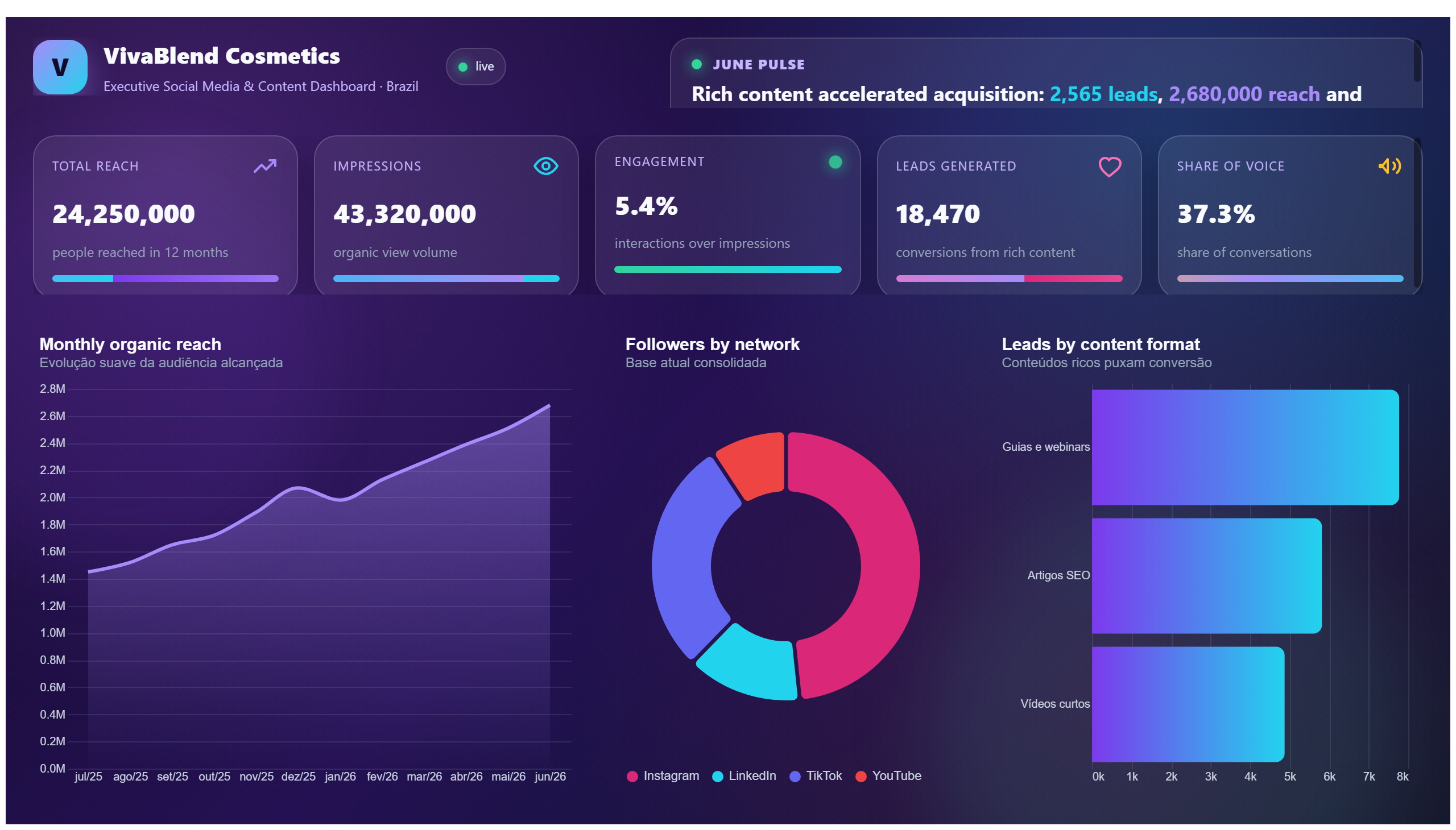
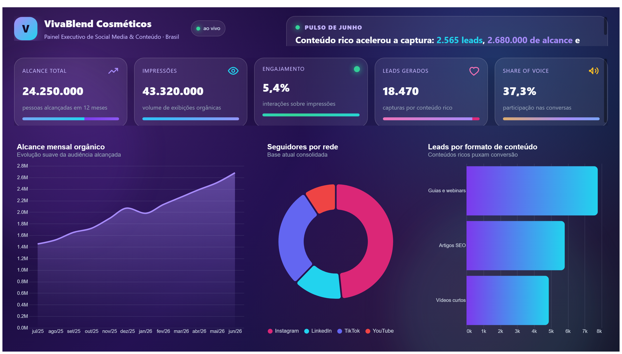
This report may show bar charts for analyzing marketing campaign performance.
Report about user experience, possibly focusing on feedback or improvements.
Save your favorite dashboards, get new templates by area and ask the AI assistant — for free.
This is a free Power BI dashboard called Taller UX, in the Marketing domain. Explore KPIs, interactive visualizations and get inspired for your own data and business intelligence projects.
Report about user experience, possibly focusing on feedback or improvements.
The Taller UX dashboard provides a comprehensive overview of user experience metrics, focusing on gathering and analyzing user feedback to drive improvements. It is designed to help marketing teams understand how users interact with their products or services, identifying pain points and areas where the user journey can be enhanced. By visualizing feedback trends and satisfaction scores, the dashboard enables stakeholders to make data-driven decisions that improve customer engagement and retention.
This report answers critical business questions such as: What are the main user concerns or complaints? Which features or touchpoints receive the highest satisfaction ratings? How are recent changes impacting overall user experience? The dashboard is particularly valuable for marketing professionals and customer experience managers who aim to align product development with user needs and expectations.
It displays qualitative and quantitative feedback focused on user satisfaction and experience improvements.
Marketing teams and customer experience managers looking to enhance user engagement and satisfaction.
By identifying pain points and tracking satisfaction trends, it guides targeted improvements based on user feedback.
We build a custom version for your business — US$ 50 per page, delivered within 7 calendar days.
Explore more Power BI dashboards from the same domain to compare KPIs, layouts and analytics models.
This report may show bar charts for analyzing marketing campaign performance.
This report may present metrics of Facebook ads, helping to evaluate advertising campaigns.
Report on pay-per-click ads, analyzing campaign effectiveness.
This report provides a summary of the Hollywood theatrical market between 1995 and 2021.
Complete projects built by the Excelverton factory: view them live and download the PBIP — 1 free downloads every 30 days with a free account, unlimited on Pro.
Save favorites, build collections and use the AI assistant — at no cost.