FlyingWhale
Report about the airline FlyingWhale, possibly focused on operations.
Create a free account
Save your favorite dashboards, get new templates by area and ask the AI assistant — for free.
About the FlyingWhale dashboard
This is a free Power BI dashboard called FlyingWhale, in the Operações domain. Explore KPIs, interactive visualizations and get inspired for your own data and business intelligence projects.
Report about the airline FlyingWhale, possibly focused on operations.
Dashboard analysis
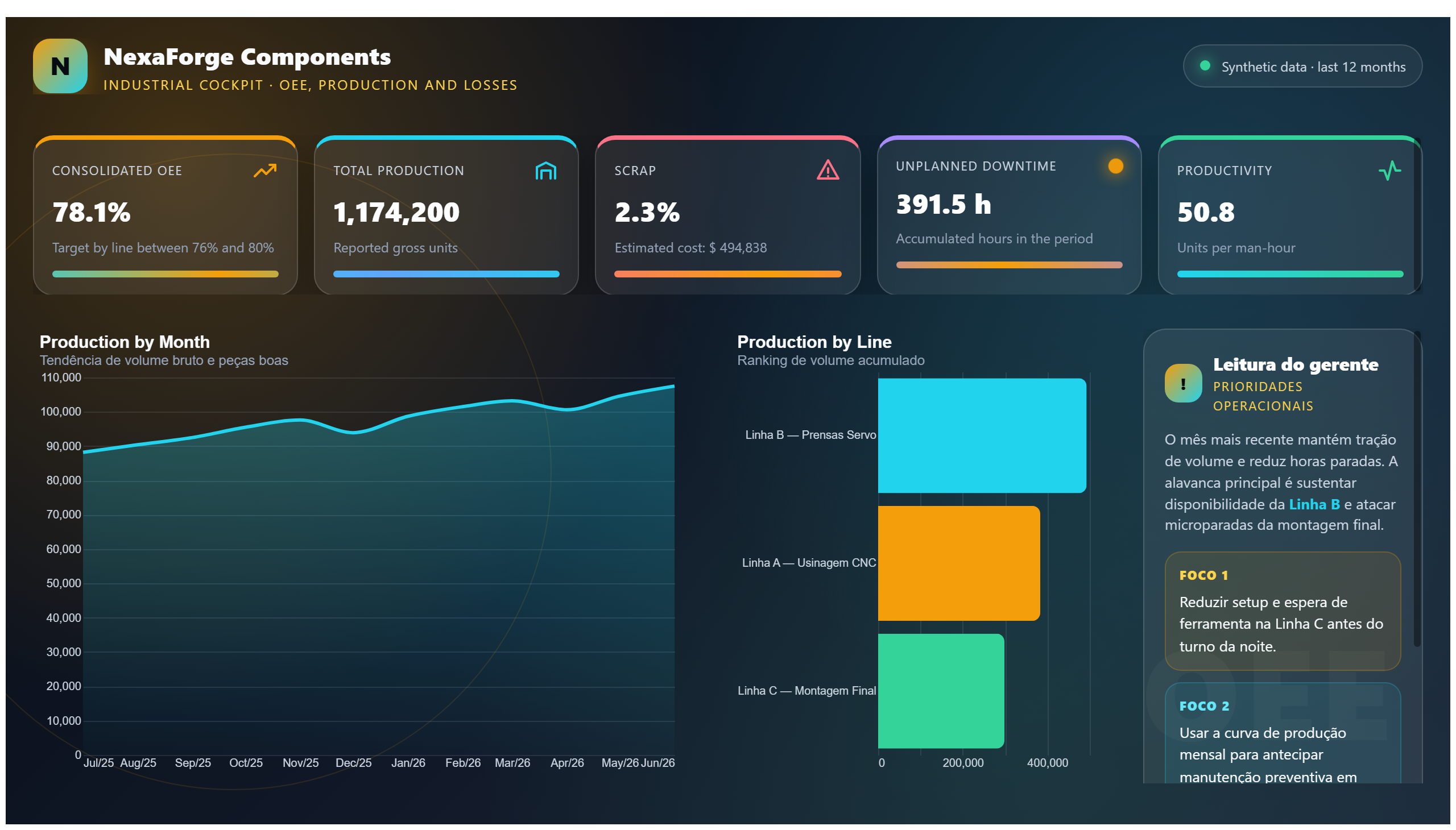
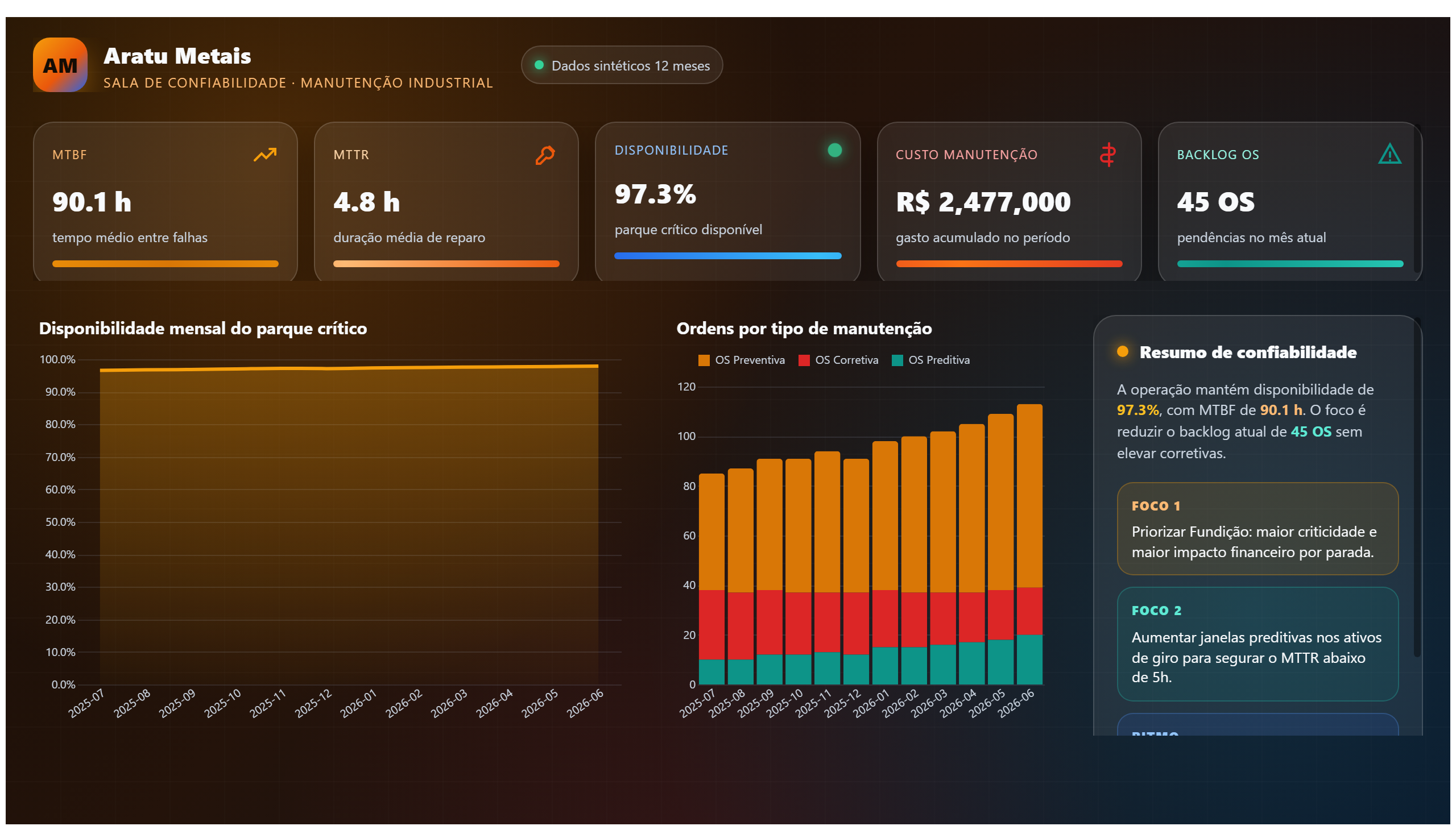
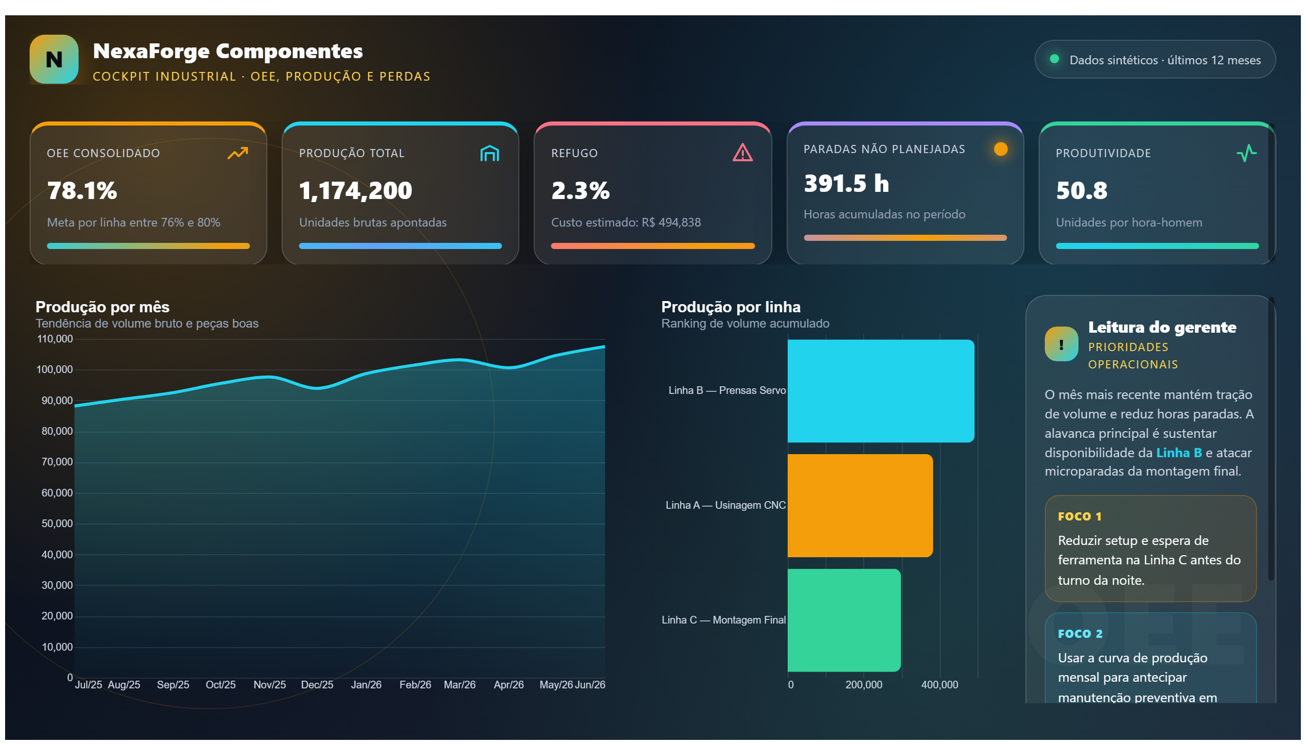
The FlyingWhale dashboard provides a comprehensive overview of the airline's operational performance, focusing on key metrics related to airport activities and flight operations. It enables users to monitor flight schedules, airport traffic, and operational efficiency, helping stakeholders identify bottlenecks and optimize resource allocation.
This report answers critical business questions such as: How efficiently are flights being managed across different airports? What are the peak operational times and potential delays? Which routes or airports require operational improvements? By visualizing these insights, the dashboard supports decision-making for airline operations managers, airport coordinators, and logistics teams aiming to enhance overall performance.
Designed for professionals involved in airline operations, the dashboard facilitates real-time monitoring and strategic planning. It empowers users to track key performance indicators and respond proactively to operational challenges, ultimately contributing to improved service quality and customer satisfaction.
Frequently asked questions about this dashboard
What operational metrics does the FlyingWhale dashboard highlight?
The dashboard highlights metrics such as flight schedules, airport traffic volumes, delay occurrences, and resource utilization across different airports.
Who is the primary audience for this dashboard?
The primary audience includes airline operations managers, airport coordinators, and logistics teams responsible for managing and optimizing flight and airport operations.
How can this dashboard help improve airline operational efficiency?
By providing real-time insights into flight and airport operations, the dashboard helps identify bottlenecks and inefficiencies, enabling proactive decision-making to enhance scheduling, reduce delays, and optimize resource use.
Want a dashboard like this with your data?
We build a custom version for your business — US$ 50 per page, delivered within 7 calendar days.
Operations Power BI templates
Complete projects built by the Excelverton factory: view them live with a free account and download the PBIP as a channel subscriber (1/month) or Pro subscriber (unlimited).
Create your free account
Save favorites, build collections and use the AI assistant — at no cost.