HealthCare_Project-Dashboard
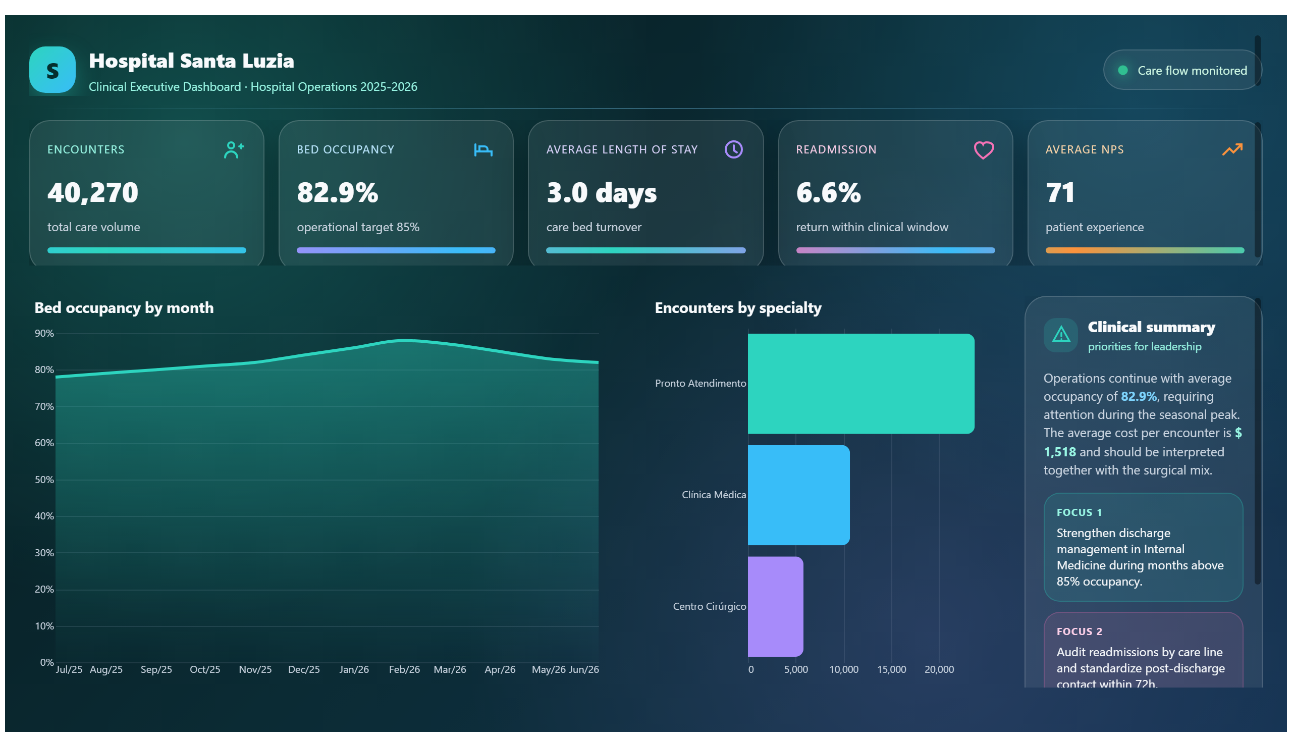
This health dashboard provides an overview of data from health-related projects.
This report may address issues related to the coronavirus pandemic.
Save your favorite dashboards, get new templates by area and ask the AI assistant — for free.
This is a free Power BI dashboard called Corona, in the Saúde domain. Explore KPIs, interactive visualizations and get inspired for your own data and business intelligence projects.
This report may address issues related to the coronavirus pandemic.
The Corona dashboard provides a comprehensive overview of data related to the coronavirus pandemic. It is designed to help health professionals, policymakers, and analysts understand the current state and trends of the pandemic by presenting key metrics such as infection rates, recovery numbers, and possibly vaccination progress. This dashboard enables users to monitor the evolution of the virus over time and across different regions or demographics.
By visualizing critical data points, the dashboard answers essential business questions such as: How is the pandemic progressing in specific areas? What are the trends in new cases and recoveries? How effective are the measures being taken to control the spread? These insights support decision-making processes in healthcare management and public health policy, helping to allocate resources efficiently and plan interventions.
Overall, the Corona dashboard serves as a vital tool for stakeholders involved in pandemic response and health surveillance, providing timely and actionable information to better understand and combat the impact of COVID-19.
The dashboard displays data related to coronavirus cases, including infection rates, recoveries, and potentially vaccination statistics.
The primary audience includes health professionals, policymakers, and analysts involved in managing and monitoring the pandemic.
By providing clear visualizations of pandemic trends and key health indicators, the dashboard helps stakeholders assess the situation and plan effective interventions.
We build a custom version for your business — US$ 50 per page, delivered within 7 calendar days.
Explore more Power BI dashboards from the same domain to compare KPIs, layouts and analytics models.
This health dashboard provides an overview of data from health-related projects.
This health dashboard likely provides an overview of health and performance metrics.
This report presents healthcare data, addressing performance and quality indicators.
This report presents a dataset about the coronavirus, possibly including statistics and trends.
Complete projects built by the Excelverton factory: view them live and download the PBIP — 1 free downloads every 30 days with a free account, unlimited on Pro.
Save favorites, build collections and use the AI assistant — at no cost.