HealthCare Analytic Dashboard
This analytic dashboard provides a detailed view of health data, with important charts and metrics.
Create a free account
Save your favorite dashboards, get new templates by area and ask the AI assistant — for free.
About the HealthCare Analytic Dashboard dashboard
This is a free Power BI dashboard called HealthCare Analytic Dashboard, in the Saúde domain. Explore KPIs, interactive visualizations and get inspired for your own data and business intelligence projects.
This analytic dashboard provides a detailed view of health data, with important charts and metrics.
Dashboard analysis
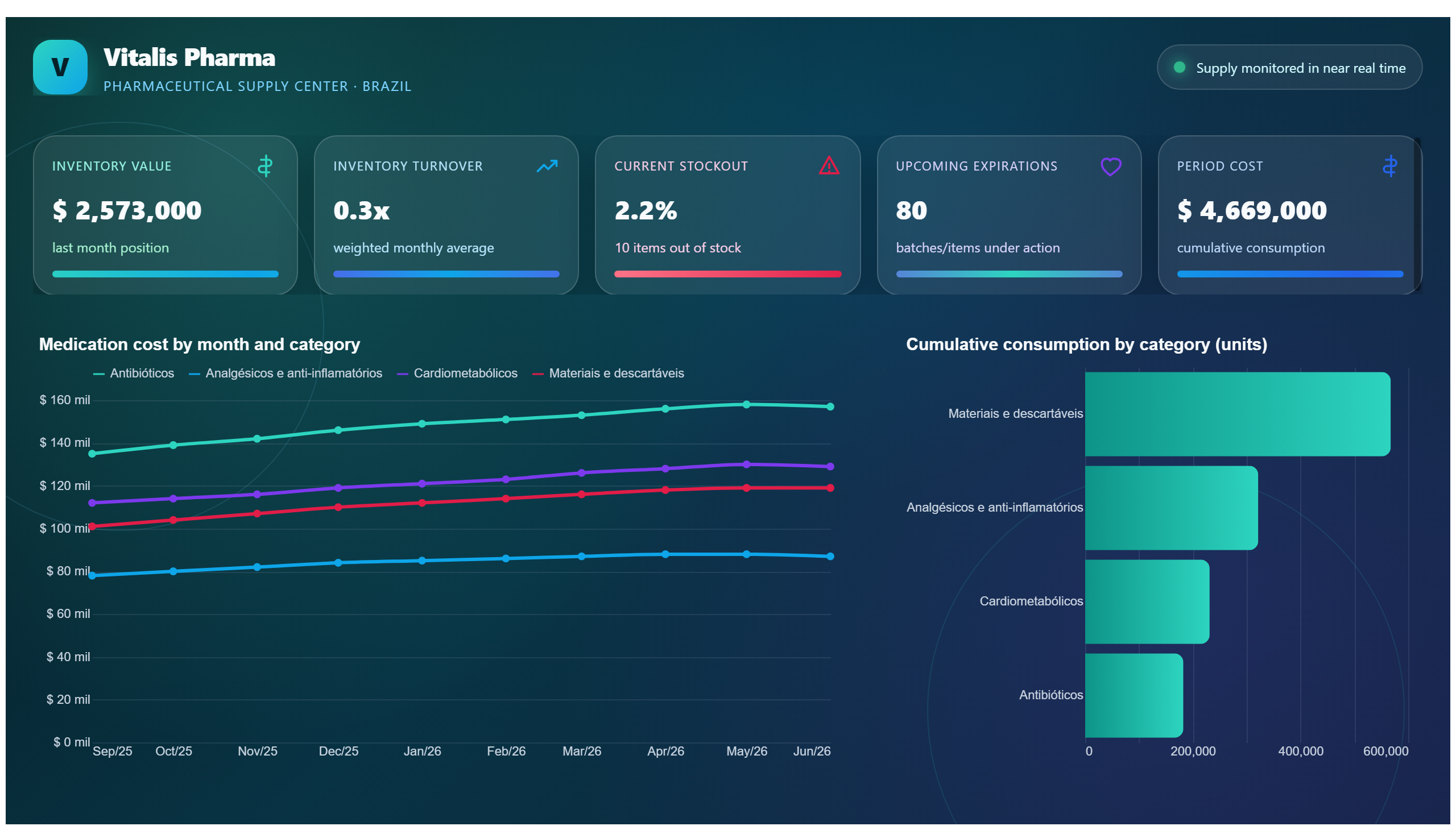
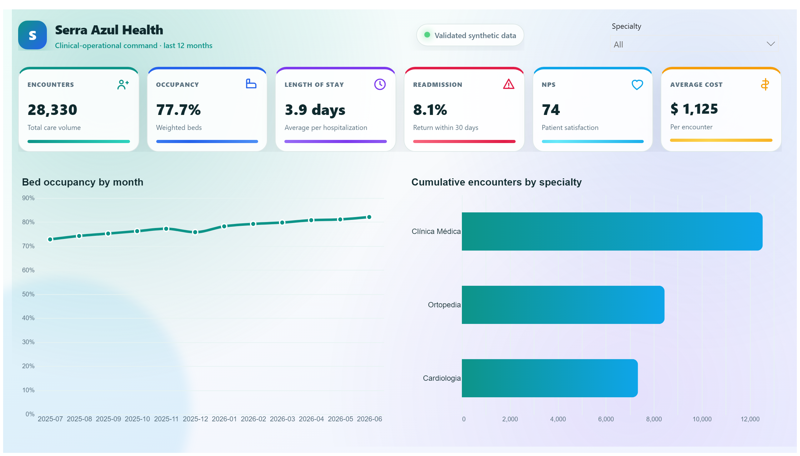
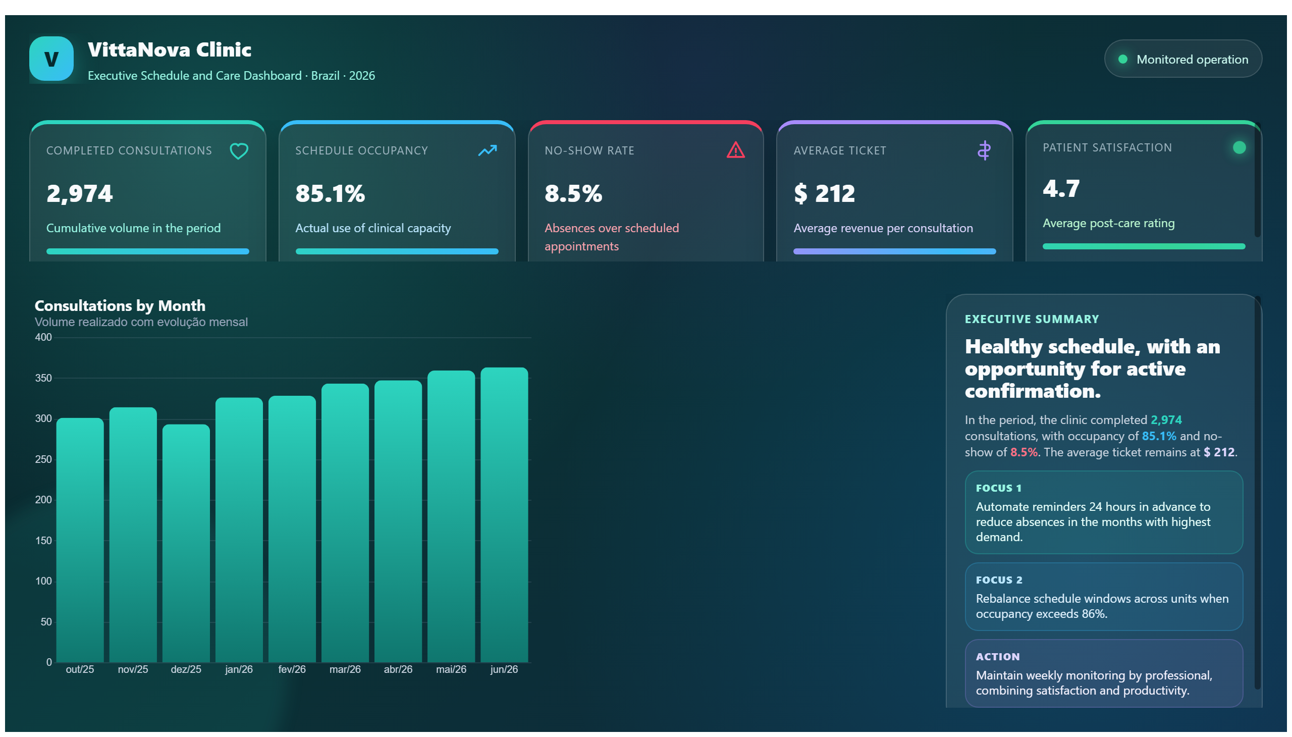
The HealthCare Analytic Dashboard offers a comprehensive overview of critical health data through intuitive visualizations and key metrics. It enables healthcare professionals and administrators to monitor patient outcomes, track resource utilization, and identify trends in health indicators. By presenting complex data in an accessible format, the dashboard supports informed decision-making across various healthcare settings.
This dashboard answers essential business questions such as: How are patient health metrics evolving over time? Which departments are experiencing higher resource demands? Are there emerging patterns in patient demographics or treatment outcomes that require attention? By addressing these questions, the dashboard helps stakeholders optimize operational efficiency and improve patient care quality.
Designed for healthcare managers, data analysts, and clinical teams, the dashboard serves as a vital tool to align strategic initiatives with real-time data insights. Its focus on health-specific analytics ensures that users can quickly identify areas for improvement and implement data-driven interventions.
Frequently asked questions about this dashboard
What types of health data are visualized in this dashboard?
The dashboard visualizes key health metrics, patient outcomes, and resource utilization data through various charts and graphs.
Who is the primary audience for this dashboard?
Healthcare managers, clinical teams, and data analysts looking to monitor and improve healthcare operations and patient outcomes.
How does this dashboard support decision-making in healthcare?
By providing detailed insights into health trends and resource use, it enables stakeholders to identify issues and optimize care delivery.
Want a dashboard like this with your data?
We build a custom version for your business — US$ 50 per page, delivered within 7 calendar days.
Healthcare Power BI templates
Complete projects built by the Excelverton factory: view them live with a free account and download the PBIP as a channel subscriber (1/month) or Pro subscriber (unlimited).
Create your free account
Save favorites, build collections and use the AI assistant — at no cost.