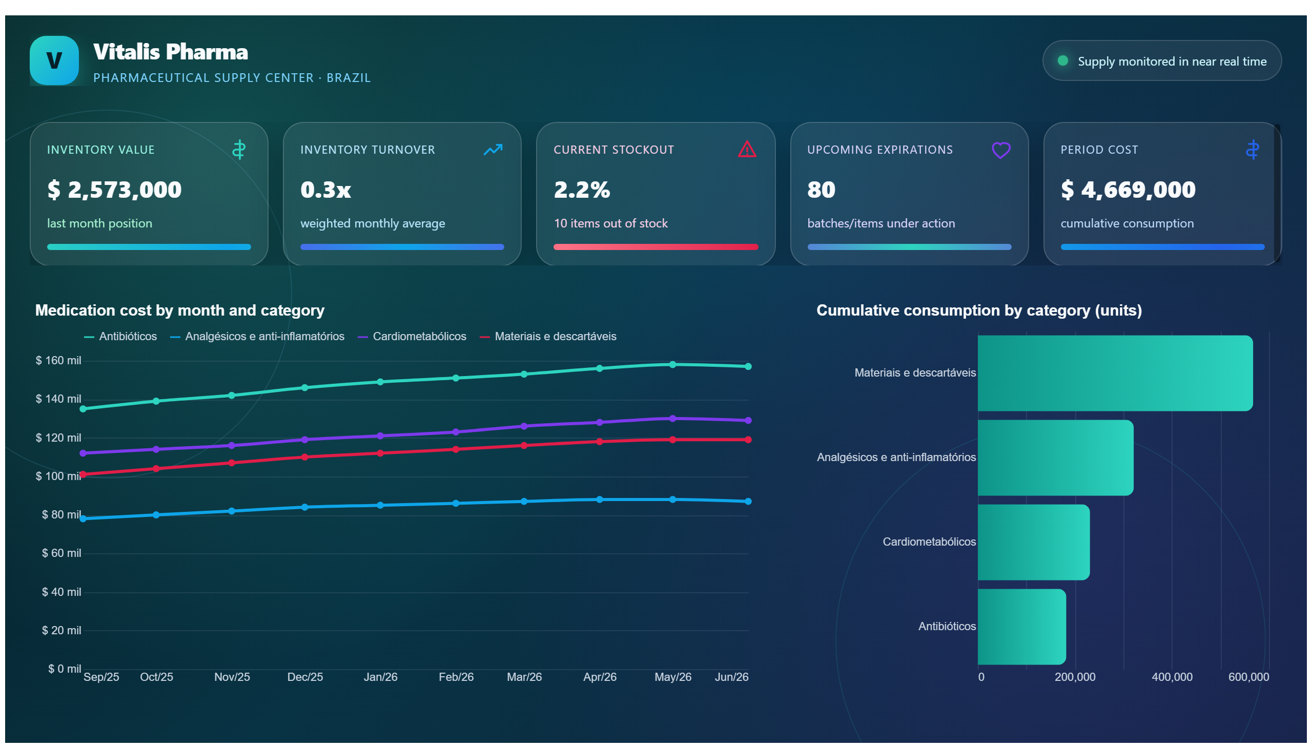
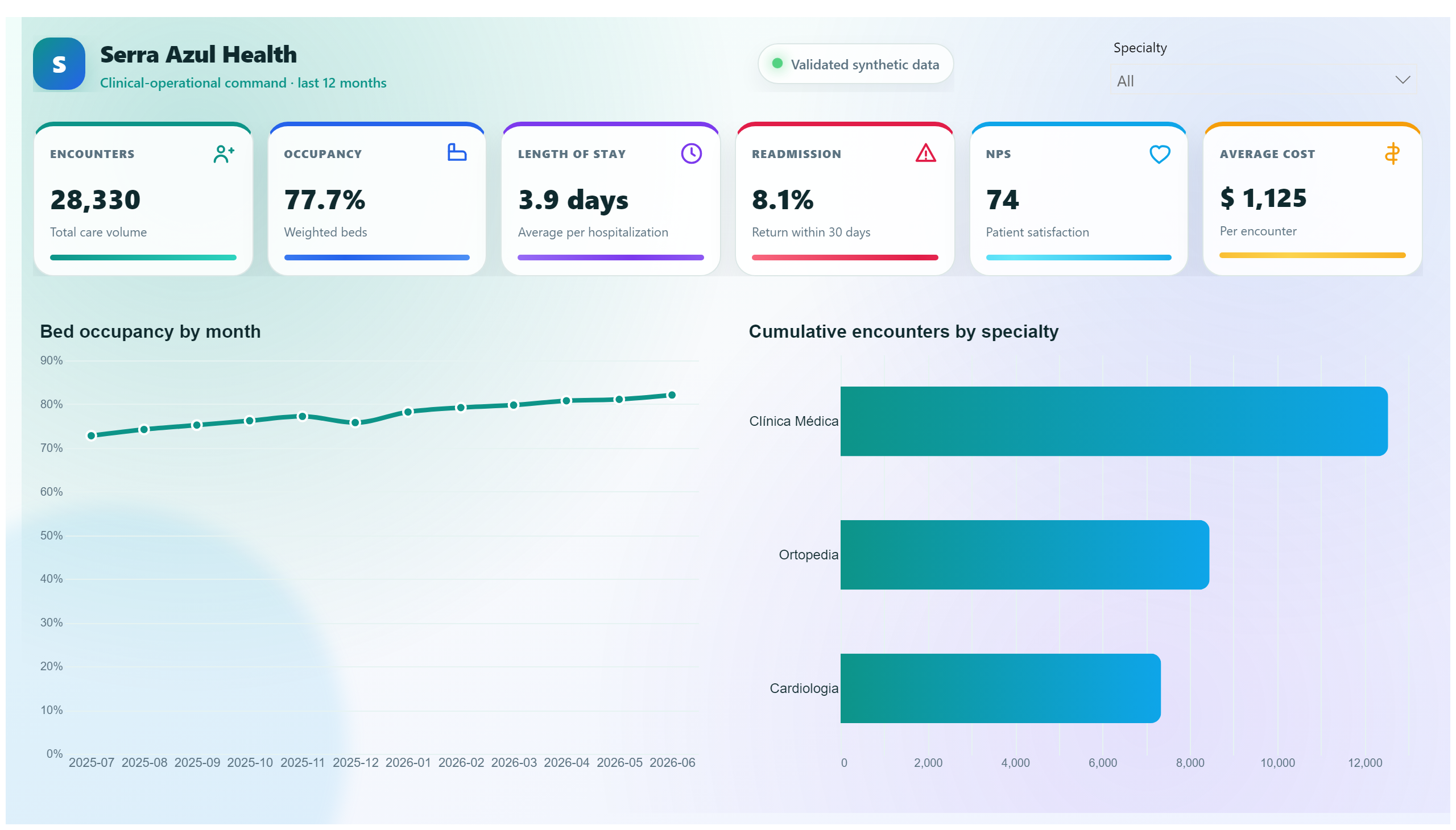
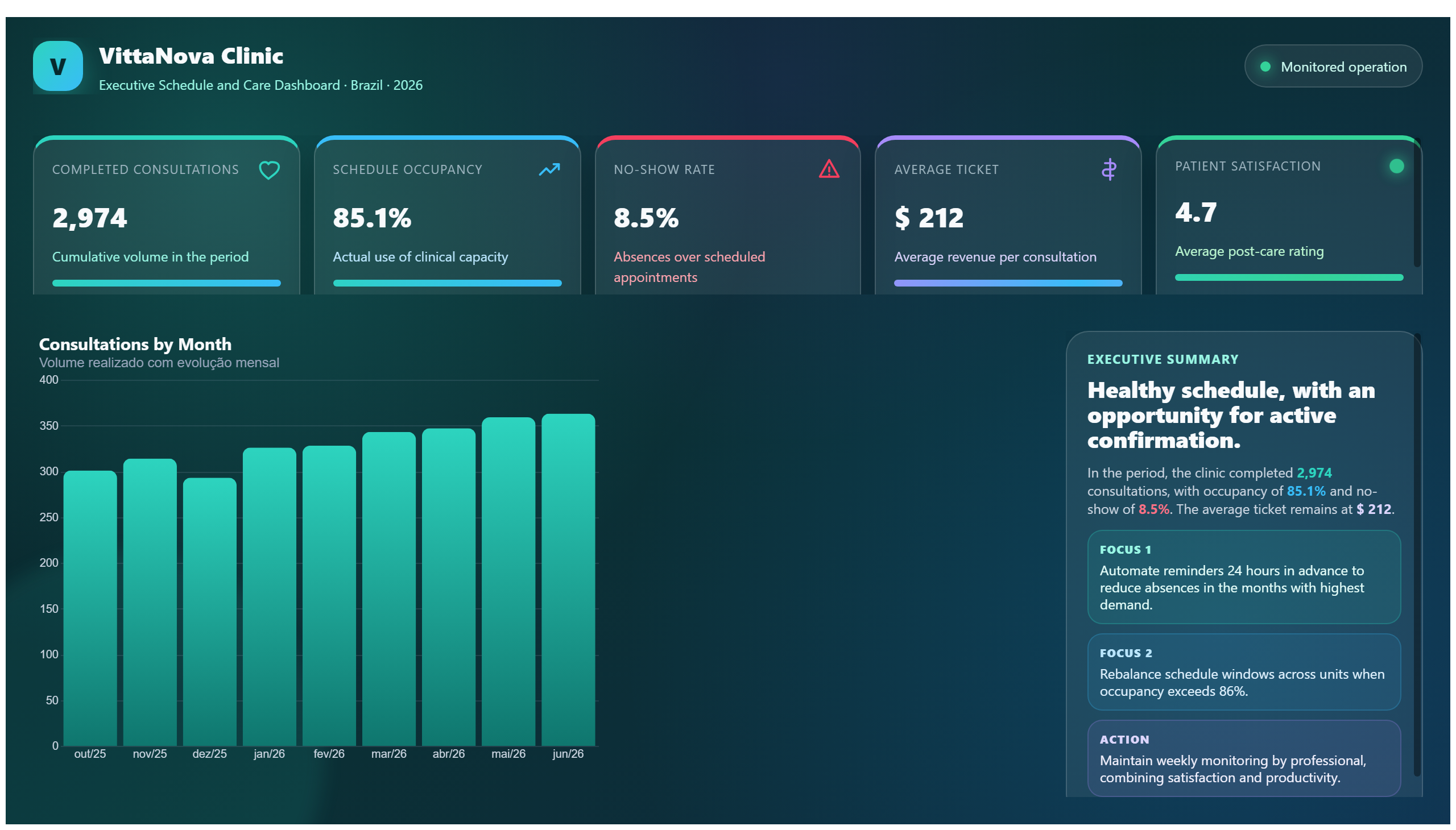
Heat Map
Heat map showing the distribution of heart diseases.
Create a free account
Save your favorite dashboards, get new templates by area and ask the AI assistant — for free.
About the Heat Map dashboard
This is a free Power BI dashboard called Heat Map, in the Saúde domain. Explore KPIs, interactive visualizations and get inspired for your own data and business intelligence projects.
Heat map showing the distribution of heart diseases.
Dashboard analysis
The Heat Map dashboard provides a visual representation of the distribution of heart diseases across different regions or populations. By using color gradients to indicate the intensity or prevalence of cardiac conditions, this dashboard allows healthcare professionals and analysts to quickly identify hotspots where heart disease is more common. This visualization helps in understanding geographic or demographic patterns, enabling targeted interventions and resource allocation.
This dashboard answers critical business questions such as: Which areas have the highest incidence of heart disease? Are there identifiable clusters or trends that suggest environmental or lifestyle factors? How can healthcare providers prioritize their efforts to reduce the burden of cardiac illnesses? It serves as a valuable tool for public health officials, medical researchers, and policy makers focused on improving cardiovascular health outcomes.
Frequently asked questions about this dashboard
What type of data is visualized in the Heat Map dashboard?
The dashboard visualizes the distribution and prevalence of heart diseases across different regions or populations using a heat map format.
Who can benefit most from using this Heat Map dashboard?
Healthcare professionals, public health officials, medical researchers, and policy makers can use this dashboard to identify high-risk areas and plan targeted interventions.
How does the Heat Map help in addressing heart disease?
By highlighting regions with higher incidences of heart disease, the dashboard supports decision-making for resource allocation, preventive measures, and focused healthcare strategies.
Want a dashboard like this with your data?
We build a custom version for your business — US$ 50 per page, delivered within 7 calendar days.
Healthcare Power BI templates
Complete projects built by the Excelverton factory: view them live with a free account and download the PBIP as a channel subscriber (1/month) or Pro subscriber (unlimited).
Create your free account
Save favorites, build collections and use the AI assistant — at no cost.