Case study on Power BI Analysis of UPI Transactions
This case study analyzes UPI transactions, possibly in a financial context.
Create a free account
Save your favorite dashboards, get new templates by area and ask the AI assistant — for free.
About the Case study on Power BI Analysis of UPI Transactions dashboard
This is a free Power BI dashboard called Case study on Power BI Analysis of UPI Transactions, in the Financeiro domain. Explore KPIs, interactive visualizations and get inspired for your own data and business intelligence projects.
This case study analyzes UPI transactions, possibly in a financial context.
Dashboard analysis
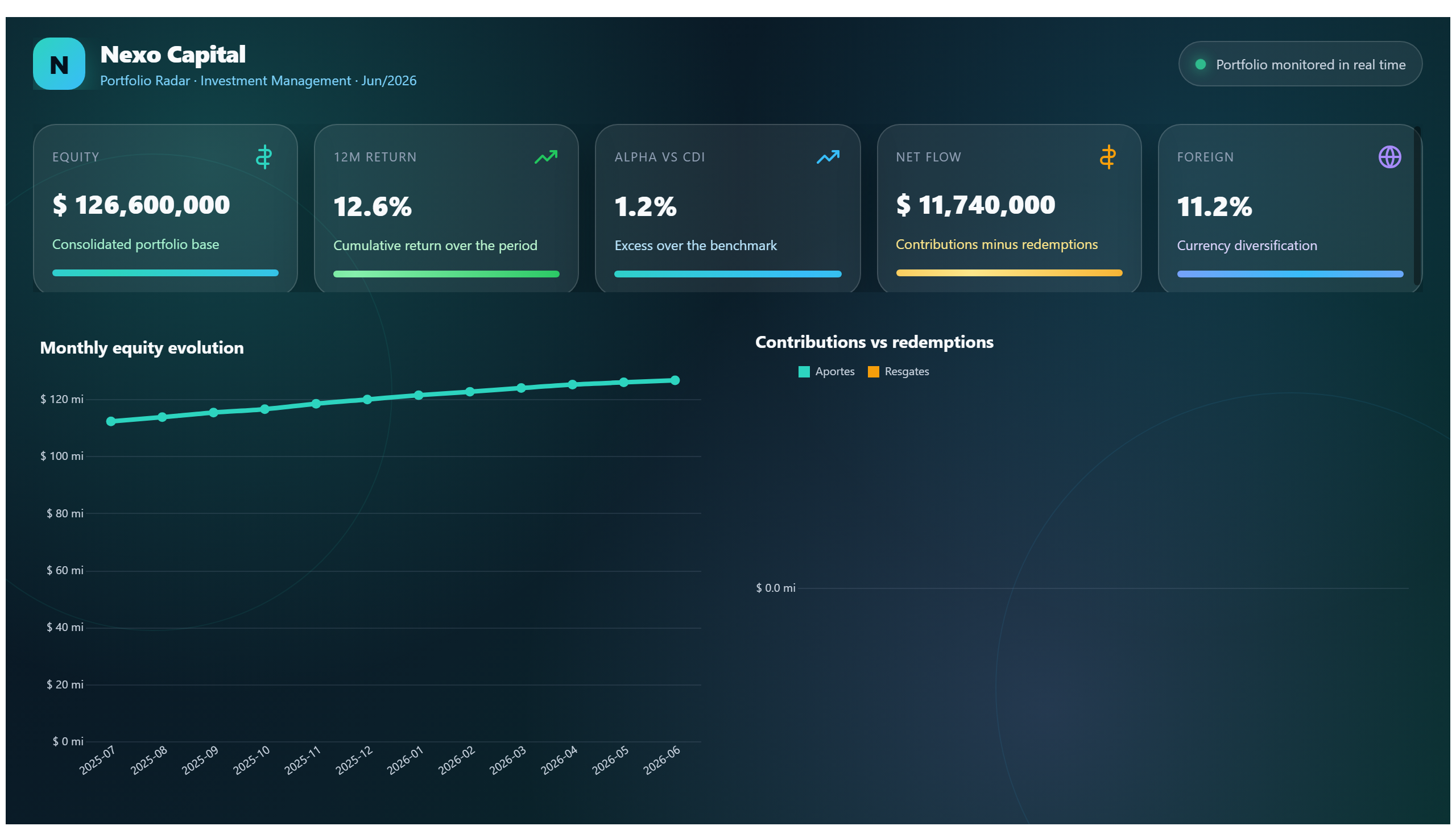
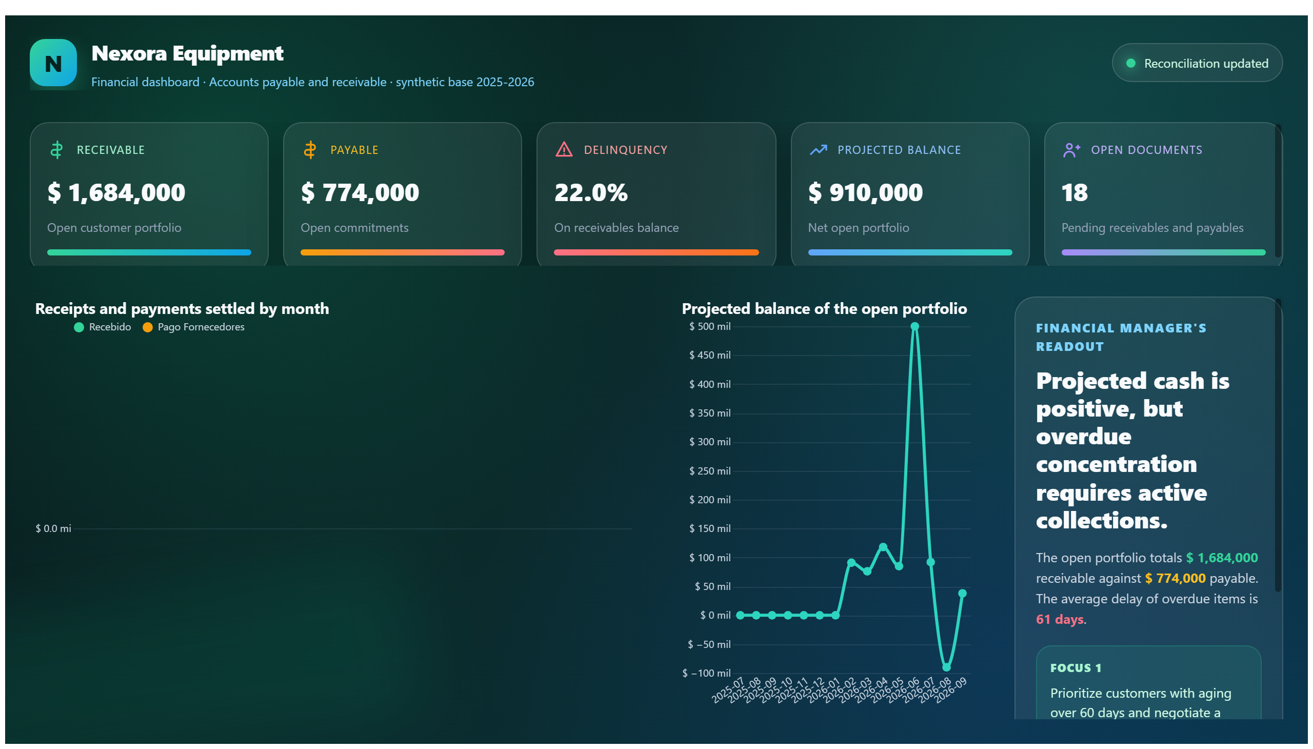
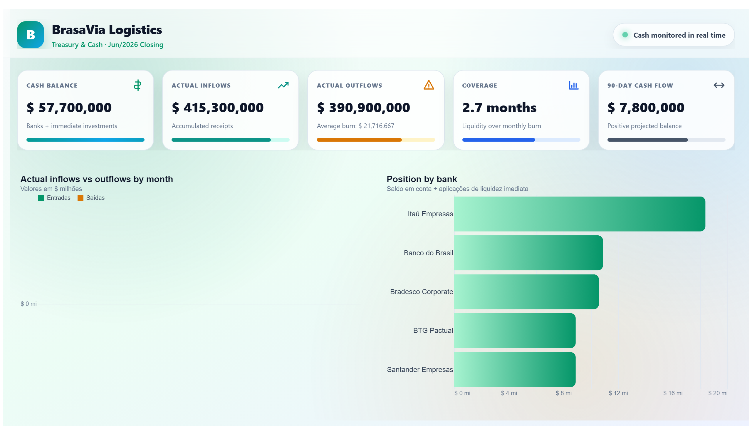
This dashboard presents a detailed case study on the analysis of UPI (Unified Payments Interface) transactions, focusing on financial data insights. It provides a comprehensive overview of transaction patterns, volumes, and trends, enabling users to understand the dynamics of digital payments within a given period. The visualizations help identify peak transaction times, transaction values, and user behavior, offering valuable information for financial institutions and analysts.
The dashboard addresses key business questions such as: What are the transaction volumes over time? Which periods experience the highest transaction activity? How do transaction values vary across different segments? By answering these questions, it supports decision-making processes related to payment system optimization, fraud detection, and customer engagement strategies.
Designed primarily for finance professionals, data analysts, and business strategists, this dashboard serves as a tool to monitor and analyze UPI transaction data effectively. It aids in uncovering actionable insights that can drive improvements in financial services and enhance the understanding of digital payment ecosystems.
Frequently asked questions about this dashboard
What types of UPI transaction trends can be identified using this dashboard?
The dashboard allows users to identify trends such as transaction volumes over time, peak transaction periods, and variations in transaction values.
Who is the primary audience for this UPI transaction analysis dashboard?
The primary audience includes finance professionals, data analysts, and business strategists interested in understanding and optimizing digital payment transactions.
How can this dashboard support business decision-making?
By providing insights into transaction patterns and volumes, the dashboard helps in optimizing payment systems, detecting anomalies, and improving customer engagement strategies.
Want a dashboard like this with your data?
We build a custom version for your business — US$ 50 per page, delivered within 7 calendar days.
Finance Power BI templates
Complete projects built by the Excelverton factory: view them live with a free account and download the PBIP as a channel subscriber (1/month) or Pro subscriber (unlimited).
Create your free account
Save favorites, build collections and use the AI assistant — at no cost.