4_4_conditional_formatting
This report applies conditional formatting, enhancing the visualization of important data.
Create a free account
Save your favorite dashboards, get new templates by area and ask the AI assistant — for free.
About the 4_4_conditional_formatting dashboard
This is a free Power BI dashboard called 4_4_conditional_formatting, in the Operações domain. Explore KPIs, interactive visualizations and get inspired for your own data and business intelligence projects.
This report applies conditional formatting, enhancing the visualization of important data.
Dashboard analysis
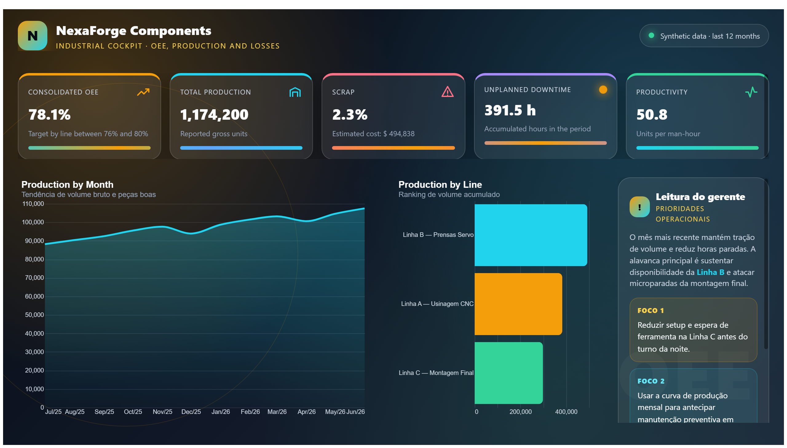
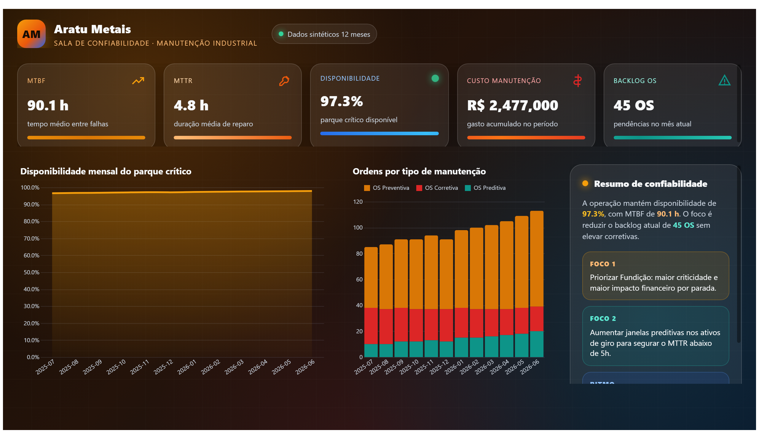
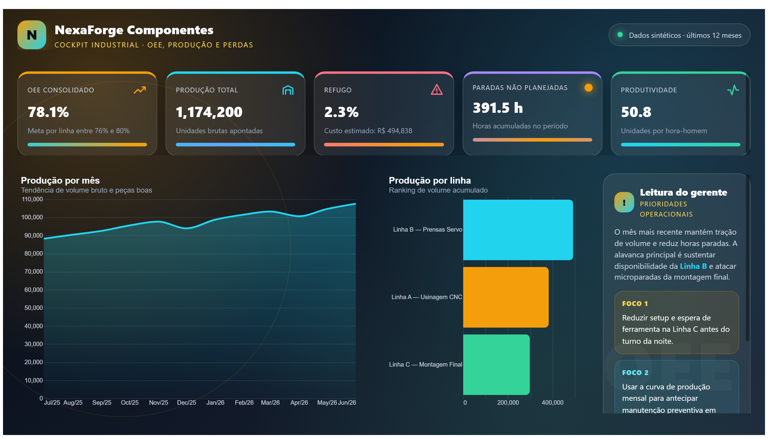
This dashboard demonstrates the use of conditional formatting to enhance the visualization of key operational data. By applying color codes and visual cues directly within tables or charts, it allows users to quickly identify trends, outliers, or critical values without needing to analyze raw numbers extensively.
It is designed to answer business questions such as: Which operational metrics are performing above or below target? Where are the areas that need immediate attention? How do different segments compare in terms of performance? The conditional formatting highlights these insights clearly, enabling faster decision-making.
This report is particularly useful for operations managers and analysts who need to monitor performance indicators regularly and communicate findings effectively to stakeholders. The improved data visualization supports proactive management and operational efficiency.
Frequently asked questions about this dashboard
What type of conditional formatting is applied in this dashboard?
The dashboard uses color scales and data bars to visually differentiate values based on their magnitude or status.
How does conditional formatting improve operational decision-making?
It allows users to quickly spot high-risk or high-performing areas by highlighting critical data points, reducing the time needed to interpret complex datasets.
Who is the primary audience for this dashboard?
Operations managers and analysts who require clear and immediate insights into operational metrics to drive timely actions.
Want a dashboard like this with your data?
We build a custom version for your business — US$ 50 per page, delivered within 7 calendar days.
Operations Power BI templates
Complete projects built by the Excelverton factory: view them live with a free account and download the PBIP as a channel subscriber (1/month) or Pro subscriber (unlimited).
Create your free account
Save favorites, build collections and use the AI assistant — at no cost.