CitibikeSummerAnalysis
Analysis of Citibike data during summer, showing usage patterns and demand.
Create a free account
Save your favorite dashboards, get new templates by area and ask the AI assistant — for free.
About the CitibikeSummerAnalysis dashboard
This is a free Power BI dashboard called CitibikeSummerAnalysis, in the Logística domain. Explore KPIs, interactive visualizations and get inspired for your own data and business intelligence projects.
Analysis of Citibike data during summer, showing usage patterns and demand.
Dashboard analysis
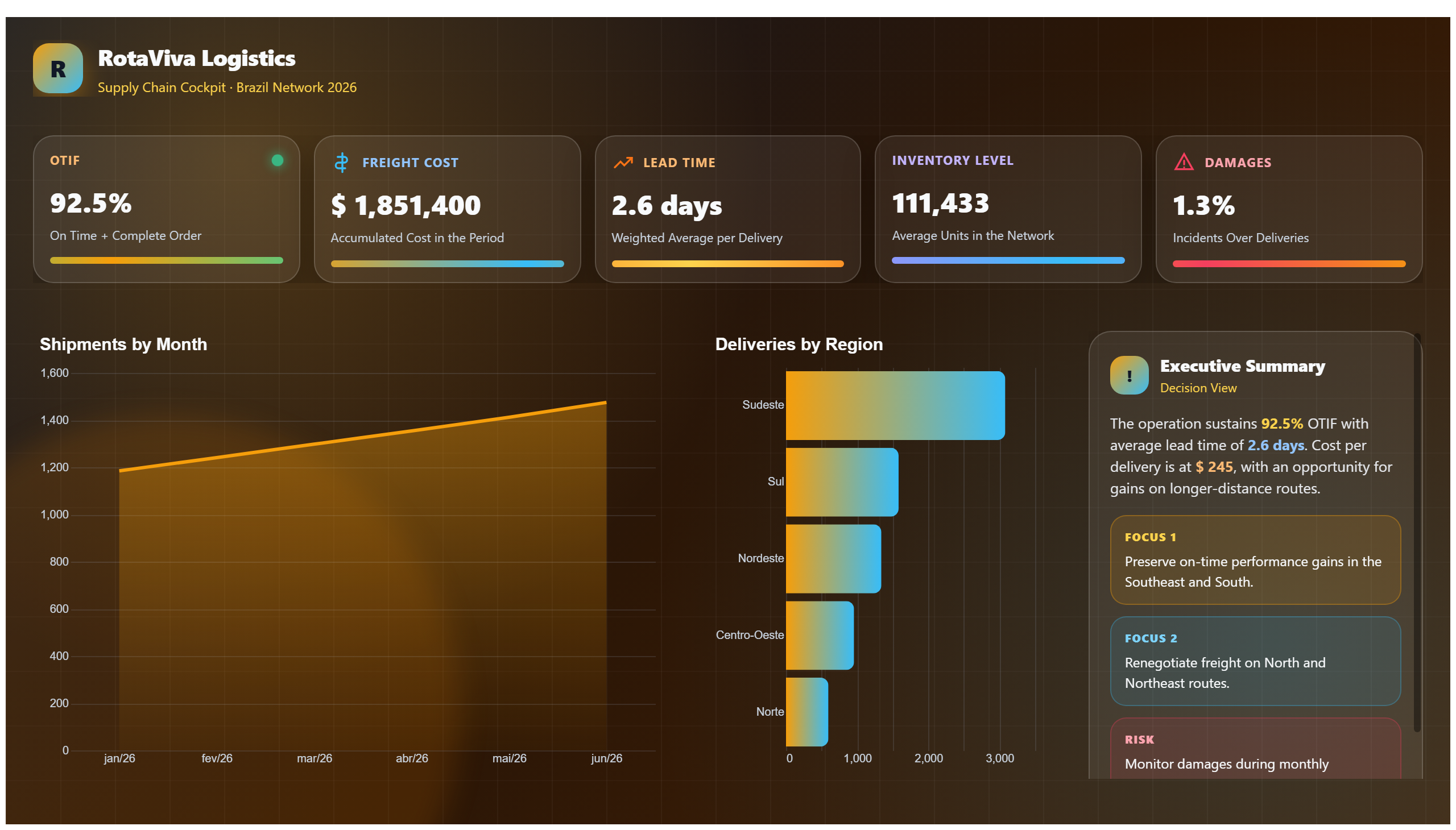
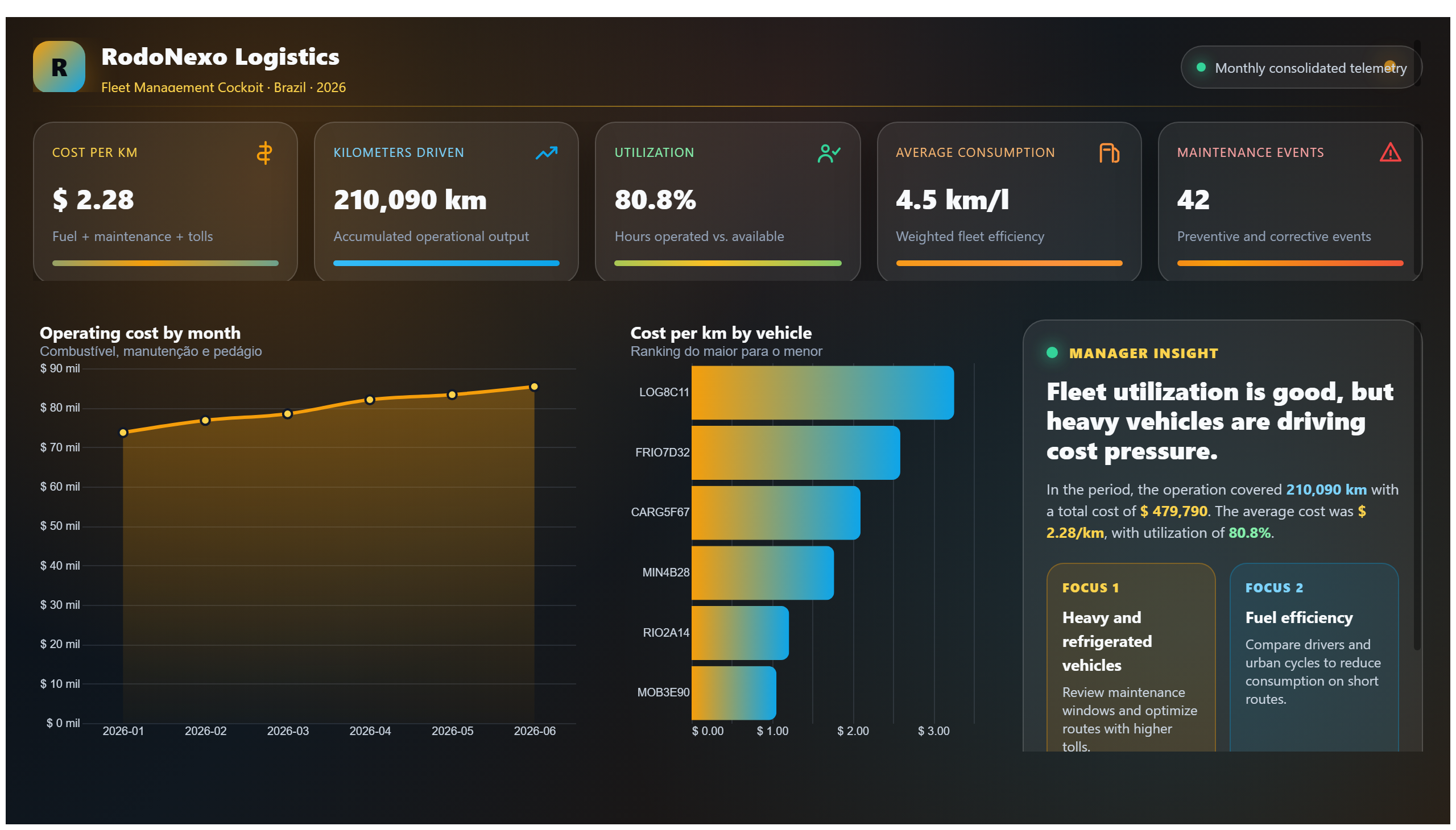
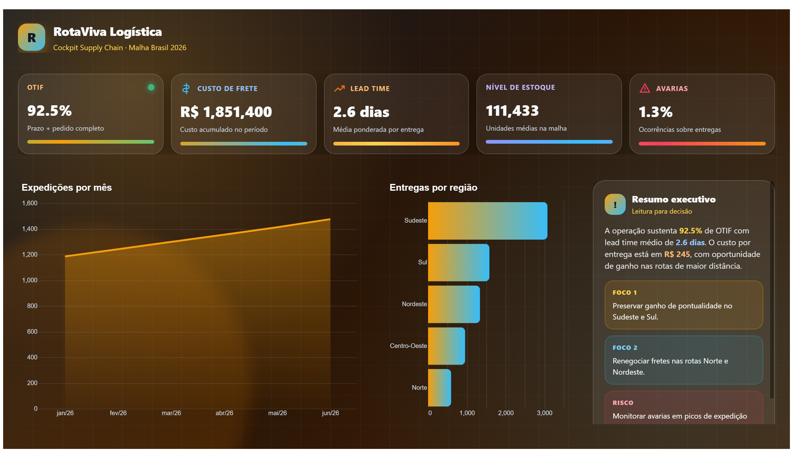
The CitibikeSummerAnalysis dashboard provides a comprehensive overview of Citibike usage patterns during the summer months. It visualizes key metrics such as trip frequency, peak demand times, and popular routes, allowing stakeholders to understand how seasonal factors influence bike-sharing behaviors. By analyzing these trends, the dashboard helps identify periods of high and low usage, enabling better resource allocation and operational planning.
This dashboard answers critical business questions like: When are the busiest times for Citibike rides in summer? Which stations experience the highest demand? How do usage patterns vary across different days or weeks? These insights support transportation planners, city officials, and Citibike operators in optimizing bike availability, improving customer satisfaction, and planning maintenance schedules effectively.
Overall, the dashboard serves as a valuable tool for anyone involved in urban mobility and transportation management, providing data-driven insights to enhance the efficiency and user experience of the Citibike system during the peak summer season.
Frequently asked questions about this dashboard
What time periods show the highest Citibike usage during summer?
The dashboard highlights peak demand times, typically during morning and evening commute hours, reflecting increased usage in these periods.
Which stations are the most popular in the summer according to the analysis?
The dashboard identifies key stations with the highest trip starts and ends, indicating hotspots of bike-sharing activity during summer.
How can this dashboard help improve Citibike operations?
By revealing usage patterns and demand fluctuations, the dashboard enables operators to optimize bike distribution and maintenance schedules during the summer season.
Want a dashboard like this with your data?
We build a custom version for your business — US$ 50 per page, delivered within 7 calendar days.
Logistics Power BI templates
Complete projects built by the Excelverton factory: view them live with a free account and download the PBIP as a channel subscriber (1/month) or Pro subscriber (unlimited).
Create your free account
Save favorites, build collections and use the AI assistant — at no cost.