Color Picker
Report that can be used to select colors in data visualizations.
Create a free account
Save your favorite dashboards, get new templates by area and ask the AI assistant — for free.
About the Color Picker dashboard
This is a free Power BI dashboard called Color Picker, in the Operações domain. Explore KPIs, interactive visualizations and get inspired for your own data and business intelligence projects.
Report that can be used to select colors in data visualizations.
Dashboard analysis
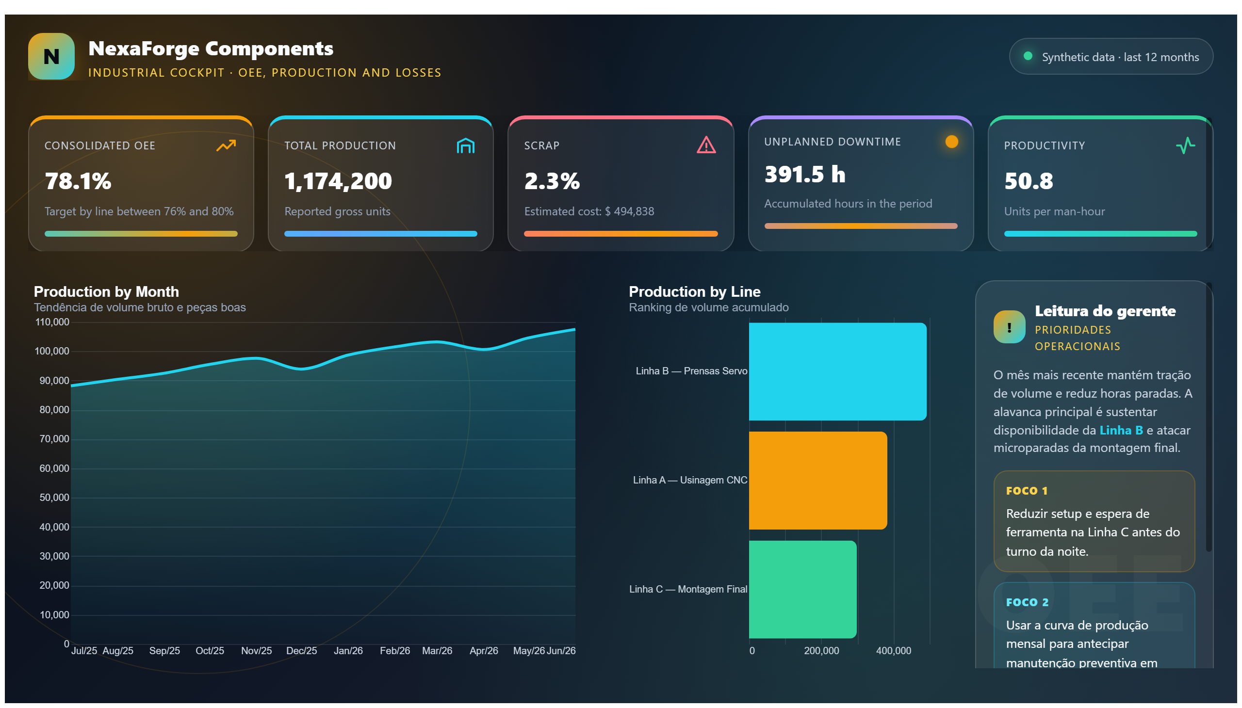
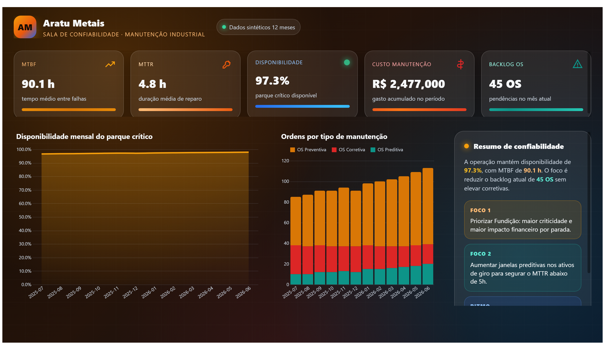
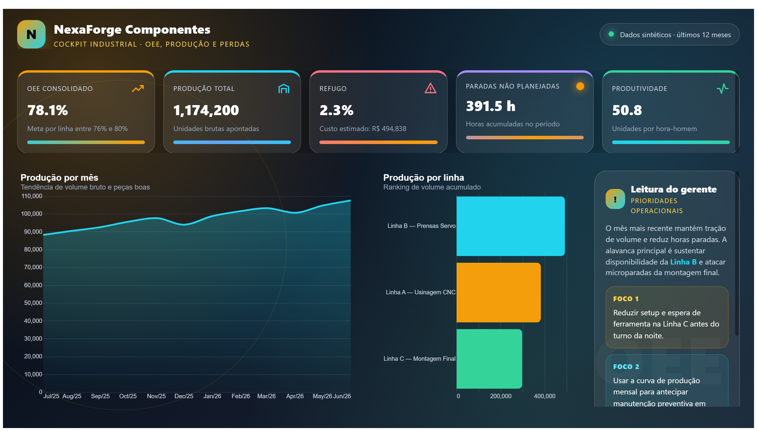
The Color Picker dashboard is a practical tool designed to assist users in selecting colors for data visualizations. By providing an interactive interface to choose and compare colors, it ensures that visual elements in reports and dashboards are both aesthetically pleasing and effective in conveying information. This dashboard is particularly useful in operational settings where clarity and design consistency are crucial.
Users can leverage this report to answer key questions such as which color combinations enhance readability, how to maintain brand color standards across different reports, and how to differentiate data categories visually. It supports decision-making related to the visual design of operational data presentations, helping teams to create dashboards that are not only informative but also visually engaging.
Ideal for data analysts, report designers, and operations managers, the Color Picker dashboard streamlines the process of color selection, reducing guesswork and improving the overall quality of data visualization projects within an organization.
Frequently asked questions about this dashboard
What is the primary purpose of the Color Picker dashboard?
Its main purpose is to help users select and compare colors for data visualizations to improve design and readability.
Who is the intended audience for this dashboard?
The dashboard is intended for data analysts, report designers, and operations managers involved in creating or reviewing data visualizations.
How does this dashboard support operational decision-making?
By enabling consistent and effective color choices, it helps ensure that operational reports are clear and visually coherent, facilitating better data interpretation.
Want a dashboard like this with your data?
We build a custom version for your business — US$ 50 per page, delivered within 7 calendar days.
Operations Power BI templates
Complete projects built by the Excelverton factory: view them live with a free account and download the PBIP as a channel subscriber (1/month) or Pro subscriber (unlimited).
Create your free account
Save favorites, build collections and use the AI assistant — at no cost.